Showing posts with label Jennifer Labre Designs. Show all posts

Tuesday, May 31, 2011

Recent Favorite Layouts!

Hi Everyone!  Summer has started and I haven't shared a whole bunch of layouts recently, so I thought I'd do that today!  


Scrap Orchard released their new monthly collab, June 2011: Sand, Sea and Surf, and it is just prefect for those summer pictures!  I love how my layout turned out and really, really love the paper placement across my double layout!  A true favorite layout - but that happens after I create each layout!  LOL!


June 2011: Sand, Sea & Surf - Scrap Orchard Designers
Font is ScrapRound


I just love it!  I should, lol!  I love the colors, and the pictures are perfect for the kit!  I used the title after thinking about Colin and Shayne trying to reach for the sun!  A great day!  


Here is another fun, bright and happy kit - Jennifer Labre's Captured! I love this layout too!  Looking at my boys smiling, and laughing, really makes me bust out a big ol grin and some giggles!  
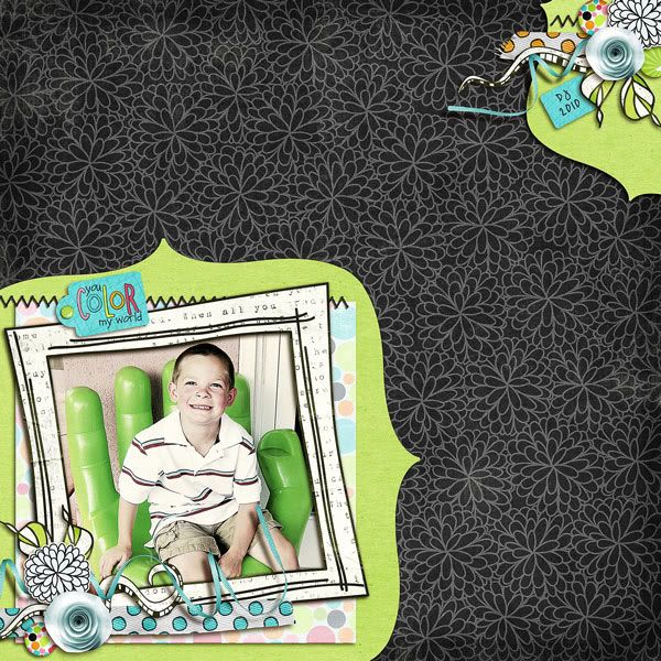
Captured by Jennifer Labre Designs
Font is The Modern One by Heather Hess.
Those are my recent favorites!  I love them!  I hope you enjoyed peeking at some of my layouts and some fun kits too!  Come back for a visit - next up is a tutorial!  Which would you rather... a tutorial on Content Aware and how to use it or something else?  Share what you want!  

Have a great week! THanks for visiting! 
Jenn (jk703/The Typative Scrapper)

Wednesday, April 6, 2011

Layouts... Layouts and some more Layouts.. oh... and 2 CT Calls!

Hi Everyone!  I'm always posting tutorials... so I'm going to share some recent layouts that I have done... and then 2 CT calls that you should send your apps in... RIGHT AWAY!  :)

All images are linked to my gallery.... hint, hint.... lol!  :)
First up are my layouts (that I am behind in making) for my P52 project!  It doesn't bother me that I am behind, because I have every intention of working on them... time just goes a lot faster than I can scrap!  You might have noticed that my continuous theme for this album is paper blocking.  I try to add a little color and some cute ellies to each P52 layout, and paper blocking is an easy and fun way to make it pop!  What do you think?

Week 4 Layouts, credits between the pages.  Jenn's papers are just awesome and pop off that pale BG... I love them!
Color Me Happy - Jennifer Labre Designs
Scrapping with Liz - Block Templates
Font is The Pencil by Heather Hess


Week #5 Layouts, credits between the pages.  Amy's kit was a fun flea market kit and had great little ellies with a shabby feel.  I used a photo treatment to match my pics to the kit!  Another little tidbit... see the pale, pale brush on the creme background?  That is an awesome grunge spot from Inspirations from Day... a perfect little boost to add to any BG!
Saturday Flea Market by Amy Stoffel
Grunge Smears by Inspirations By Day
"Zine" Style Templates bu Scrapping with Liz
Font is Throw My Hands Up In The Air. 

ScrapMatters introduced a fun idea in April... the Mix A Kit!  It ties all the designers together with the same palette.  You get so many things to choose from, and basically make the kit you want!  So custom made!  Here is a layout that I made with A LOT of the pieces!  :)
Credits below, and my page is linked!  :)

Spring Stitches by Inspirations by Day
Springy: The Elements by WM [squared]
Footloose and Fancy Pattern Papers by Graham Like The Cracker
Letterpress Paper Pack by Chelle’s Creations
Sprung: Little Bits by Stolen Moments Designs
Spring Punch Alpha by Jennifer Labre Designs
Spring Punch Papers 2 by Jennifer Labre Designs
Blueprints Set 3 by True Blue Studio
I love scrapping double pages... I know they will fit nicely together in my printed books, and it also allows me to use the supplies a little more!  We all have that big a stash that it makes me feel better that I've used things a couple extra times, lol!  My most recent page... I'm waiting on summer to come, so I thought I'd scrap it!  Plus, this kit is sooooo girlie... I mean, c'mon... It's A Chick Thing... .just called out a challenge to show off the masculine side of the kit!  Credits between pages.

It's a Chick Thing by Spinky Dink Scraps and Daybreak Scraps
Sweet Spring Set 2 by True Blue Studio
Font is Teletype.

Thanks for checking out my pages... remember, hint, hint... I love love!  LOL!  Up next will be some sort of tip or tutorial.... I have a couple ideas!  IF there is something that you would like to see, please share!


I almost forgot... check out these two CT calls over at ScrapMatters.... So, get those apps in... and fast!


AND...

Again... Thanks for visiting!
Jenn
(jk703/The Typative Scrapper)

Thursday, March 24, 2011

Project 52: Catch Up, lol... not Pick Up! :)

Hi Everyone.... Just a quick pop in today to show off my recent Layouts for P52.  I am so nutty at work lately, and with only so much time, blogging has slid a little... but I'll be sure to post some more layouts and tutorials soon!  Share them... someone might learn something!  :)

I last showed off Week 1... so now to show off Week 2, and 3!  Here you go!


Week #2 used the following supplies:  Fiddle Dee Dee -- Verbosity Album,  Geek Chic Scraps and Spinky Dink Scraps -- Tell Me About It Kit,  WM [Squared] -- Vintage Summer Alphabet, and the font is Earthquake Typewriter. Photo Action by Paint the Moon.  Note: Scrap Goodies in my picture are from Chelle's Creations and Stampin Up!


Week #3 used these yummy goodies: Jennifer Labre Designs - Winter Wishes and Fiddle Dee Dee Designs - Fuss Free Day by Day: Set 1(was at ScrapMatters, will hopefully be moved to The Digichick soon!) & Fuss Free: Square Pegs.  


It sure seems like snow and winter are the main themes of my pages, but we've gotten so much snow that I am done with winter for the next 5 years!  Really... it is March now... and guess what, we got snow today!  Hello... spring has started!  Hopefully I will get some spring shots for my P52 soon! My main theme for my P52 is simple.... fun pictures, a bit of journaling and paper blocking.  I wanted to keep it easy, no stress and fun to scrap!  I may be behind, but I am doing it and enjoying it!  


I'll be back with Week #4 and Week #5 which are done... sometime this weekend!  


Thanks for visiting!
Jenn (jk703)


Sunday, February 27, 2011

Masking Unmasked

Masking Unmasked
Masks are ways that you can change up your layout and give it a little fade effect that will make the whole layout pop! This is a really easy technique to learn. You can use masks for many many things, but it seems that they are widely used with papers and photos. When you learn how to mask, you are also learning a way to non-destructively edit your photos. By that, I mean that you are able to restore your image back to the way it was originally. I also find that masks are much easier to use than working with the eraser tool, and by far, the quickest! Here are a couple of ways to try out masks for your layouts. 

Basic Clipping Mask:
  1. Open your photo in PSE or PS.
  2. Start a New Document, by Right Clicking and Duplicating your photo in a New or Untitled file. Save.
  3. Select the photo mask you wish to use, and open it in PSE or PS.
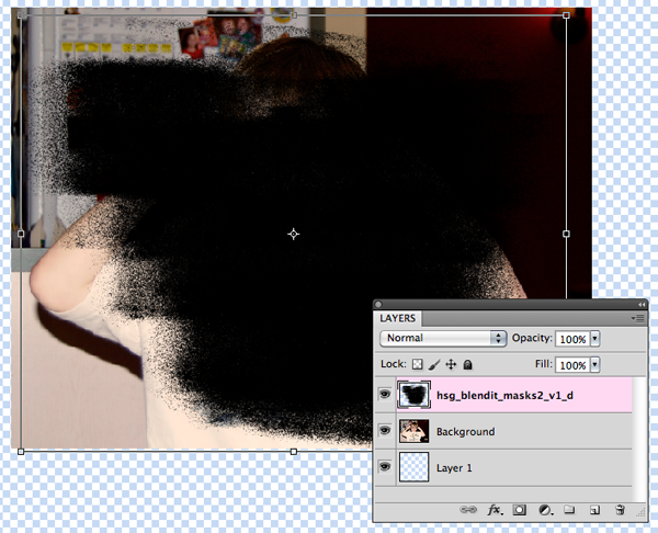
  4. Drag the photo onto the photo mask so that it is the layer above the photo mask.

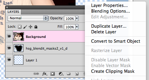
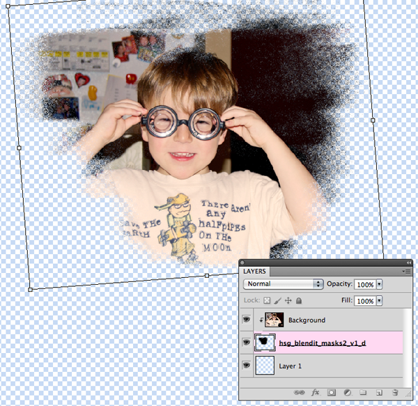
  5. Right click and select CreateClipping Mask or Ctrl+G (Mac: Cmd+G) to clip it together.
  6. To use it in a layout, select the Layer and right click, choose Merge Visible.
  7. Drag or Duplicate the photo onto your layout
Tip: If your background layer is locked, double click on it and re-name it. This will un-lock the layer.
Tip: Change the opacity of the brush in the layers to show or hide more of your photo. 

Here is a layout that I made that shows off the versatility of clipping masks and how they can be changed for different looks. In my example, I used Jennifer Labre's Love Me Do (Link:  http://shop.scrapmatters.com/product...tid=7677&cat=6, Happy Scrap Girl's, Blend It Masks 2 (Link: http://shop.scrapmatters.com/product...6&cat=0&page=1) as well as Happy Scrap Girl's Ultimate Date Material (Link: http://shop.scrapmatters.com/product...7&cat=0&page=1. On the Left side of the double, I masked my photo, a nice effect and makes the pictures similar but different. On the right side of the spread, you can see faded stripes under the photos. That is the mask with a paper clipped to it! I adjusted the opacity down, and then changed the blending mode to "Lighten" ti give it a different effect. Such a simple change, and it really makes for fun masking! Try it out!


Fading Gradient Mask:
  1. Open your photo in PSE or PS.
  2. Start a New Document, by Right Clicking and Duplicating your photo in a New or Untitled file. Save.
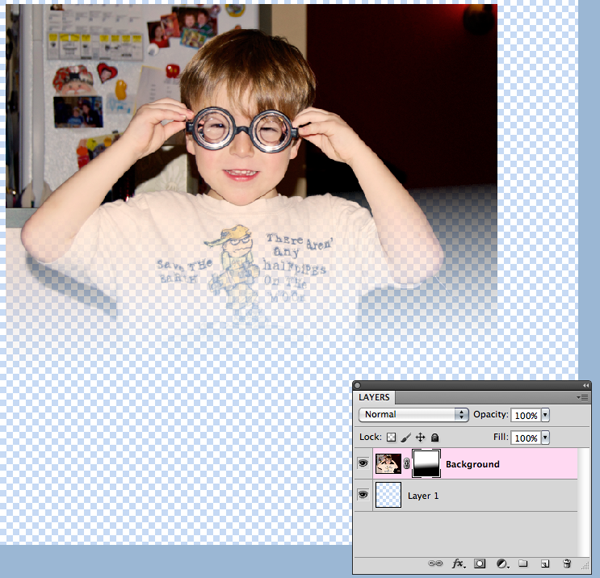
  3. Within the Layers Palette, click on the "Mask" icon at the bottom of the palette. This will add a layer mask, which you can see next to my photo. This fade is essentially a white/black fade mask. White allows the picture to show through, while black will hide the picture. Grey areas will affect how transparent (aka opacity) of the picture.
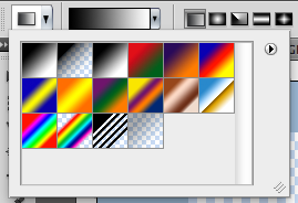
  4. Go to the Toolbars, and use the Gradient Tool.

  5. Click on your layer mask in the Layers Palette, so you know you are going to create your mask in the correct location.
  6. Click on the bottom of your picture in the middle and hold your mouse. Now, drag the cursor upward. Stop where you want the fade to end. Let the mouse button go. A faded layer mask - complete.
Tip: Set your foreground color to black (that is the one on top).
Tip: Hold the Shift key to make your cursor move in a straight line.


Brush Masks:
  1. Open your photo in PSE or PS.
  2. Start a new document by right clicking and duplicating your photo to a new or Untitled file. Save.
  3. Within the Layers Palette, add a new layer. (This new layer should be above your photo).
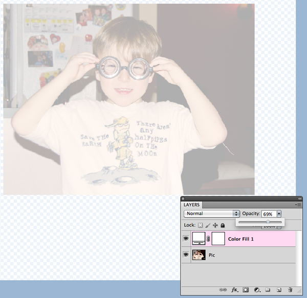
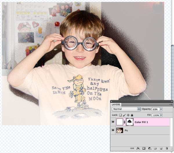
  4. Click on Layer in the Menubar, then choose New Fill Layer. Choose Solid Color, and then OK.
  5. Lower the Fill Layer's opacity until you can see the photo underneath.
  6. Choose the Brush Tool and select a soft, round brush from the menu.
  7. Choose black as the Foreground Color.
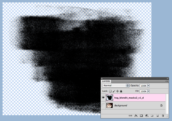
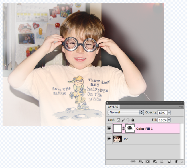
  8. Select the Mask on the Fill Layer -- this is the second square. Start painting in a zig zag or scribbly motion.
Tip: In the above example, you were looking at a white filled layer above your photo. Fill with different colors that may complement your photo. 
Tip: Before Brushing, change the opacity, and try out different amounts.

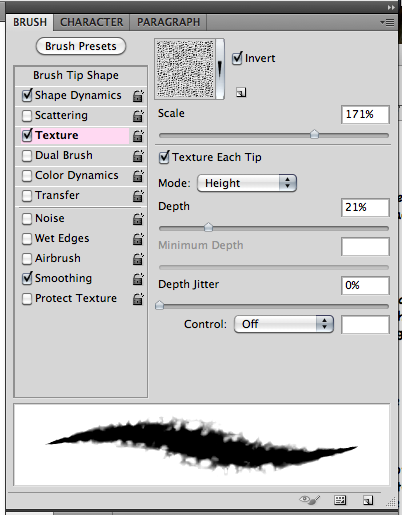
Texture Tip for Photoshop Users:
Click on the Brush Palette Tab, then click on the word Texture. Adjust the texture scale and depth to give a slight texture to the brush, according to your taste. Pictured here is Wrinkles texture on default options.Try out different textures and lay with the scales, depths, and Blending Mode to see what you can come up with. 

This image shows a faint change in the texture on the mask. A bit of texture can change up any image. Cool tool! 


Now that you know a little bit more about masking and different techniques, try it out! Remember to duplicate your photos and save the files as you work! Play with the opacity, different blend modes for textures and the color fills. You might just have found a new favorite technique to try on your layouts! Have fun!


I originally created this tutorial for the ScrapMatters Newsletter for February.  Sign up to the ScrapMatters Newsletter (more like a 20 page magazine) and get more tutorials like this, fun freebies, and great articles: HERE!

Thanks for visiting.... 
Jenn (jk703)

Wednesday, February 2, 2011

Living La Vida LOCAL! LOL!

Travels
The places that I have traveled is pretty short... I've mostly stuck to the US... I would love to travel all over, but that will wait at least until the boys are a bit older!  My favorite way to travel is cruising though!  I love it!  My list is a lot longer of places that I'd like to travel too!  (giggle). I'd love to visit Ireland, England, Australia, New Zealand, France and so many more!

When we cruised last, Shayne was 2 1/2, and we traveled to a bunch of the islands, and got to visit so many places!  It was the perfect vacation (psst... and for 3 and up they have daycare, lol)!  He was too young for the daycare, but he was REALLY good on the trip!  My parents and a bunch of family friends came along, so it was a nice group!

I'd love to plan one again for this year, but we will have to see what vacation is left -- especially after all this snow!  I really, really want to plan a scrapping one!  HA!  That would be awesome... a boat full of digiscrappers with a pool and drinks!  Ha!

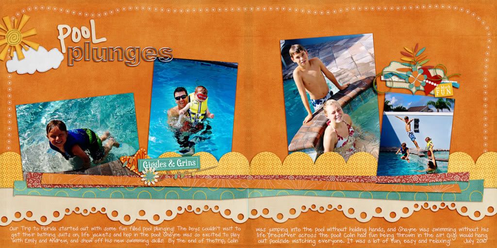
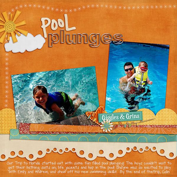
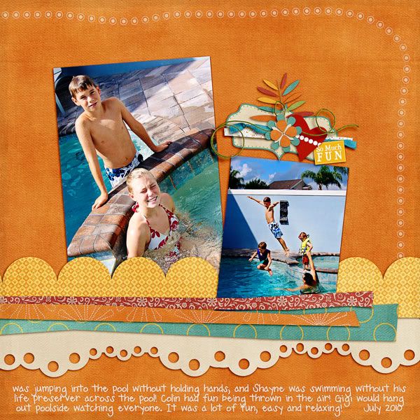
This past summer we traveled to Florida to go to Disney World!  It was a nice trip - but the best part was spending it with our family!  My uncle Tim and his kids, uncle Terry and his family, my parents, my grandmother and Peter, the boys and I all stayed together and had a blast for 10 days!  It was great to go to Disney, but even better to hang out with everyone! Here are some fun and bright pool pics from the trip:


Color Me Happy by Jennifer Labre Designs
One Cool Metal Alpha by Jennifer Labre Designs at ScrapMatters
Doodle Border Freebie by Jennifer Labre Designs
Fiddle Dee Designs - Fuss Free: Dotted Border a
Fiddle Dee Dee Designs - Fuss Free Scalloped Borders
Fiddle Dee Dee Designs - Fuss Free Stripped, Set One
Ali Edwards - Thick Summer Words
Font is Pea Emma.

Happy travels to you all!  Local or not... if you are ever in my area, let me know!  I'd love to meet up with you for some lunch or just to hang out!

Have a great one!
Jenn (jk703)


Wednesday, December 22, 2010

December Goodies! Come take a Peek!

Hi!  Happy Holidays to you and your families!  I'm just popping in to share some of my recent December layouts!  I really, really have to get these all put in a book over the school break, so maybe once I have a book being printed, I can share that link!  


First up is my 2010 Christmas Card!  I just loved it... it took awhile, but I was so happy with it!  My little boys, and me making them giggle so I could get a somewhat decent pic!  It only took me banging a container of M&M's on my head!  Who would have thought!?  I think that someone should have taken a picture of that!


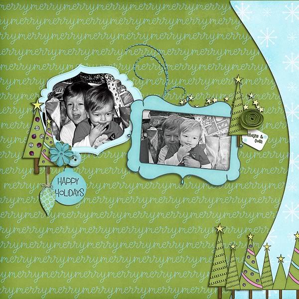
2010 Christmas Card
Supplies Used:  Erica Zane -- A Touch Of Winter(some snowflakes), GG Digital Designs -- Winter WishesFiddle Dee Dee Designs -- Fuss Free: Christmas Greetings and Ali Edwards -- Holiday Word Art.


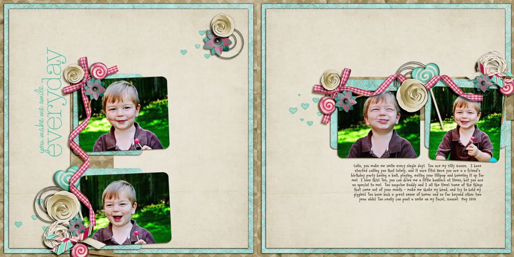
Goose!  
Photobucket


Supplies Used:  Sugar On Top Collab by Spinky Dink Scraps and Project BBlueprints Set 6 by Studio True Blue, Fine Line Page Titles No. 3 by Katie Pertiet, and the font is CK Smile.


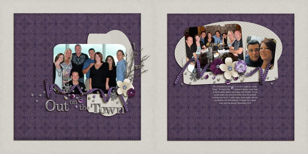
Out on the Town
Night Out Double


Supplies Used:  Winterberry by Jennifer Labre Designs, and the font is Times New Roman.

Thanks for looking and checking out my layouts!  Would love to know what you think?  Trying to improve myself, so Constructive Criticism is welcome!

Have a great day!
Jenn (jk703)

Saturday, November 20, 2010

November 2010 Layouts... I've been busy!!!! :)

Here are some layouts that I created this month!  :p

Using Jennifer Labre Design goodies and Fiddle Dee Dee Shape Templates:
Double Thumbnail... click for the larger two pager:
TDC_FDD_Edgers_JLD_Color_PlungeDbl

P1
Photobucket

P2
Photobucket


Using Geek Chic Scraps's Twinkle -- part of the November Daily Digi Files found HERE
Double Thumbnail...click for larger two pager:
Photobucket

P1
Photobucket

P2
Photobucket

Using designs from Tracy Stroud, Designs by Ziska, and Ziggle Designs:
Photobucket

Using Captivated Visions and Stolen Moments, Second Spring:
Double Thumbnail... click for larger two pager:
Photobucket

P1
Photobucket

P2
Photobucket

and last but not least.... using Collab Goodies from Studio Gypsy and Studio True Blue.
Photobucket