Just a reminder to get yourself entered into the RadLab Giveaway!!!! Wouldn't want you to miss out on an awesome editing tool that is super easy to use!
RadLab Giveaway can be found HERE!
Oh... and there is also a coupon for 15% off if you would rather purchase it! The coupon is TYPATIVE!
Trust me... it is awesome! Giveaway will end at 12 noon tomorrow, May 5th. I will be on in the afternoon to announce the winner!
Have a great weekend!
Jenn (jk703)
The Typative Scrapper

Showing posts with label Photography. Show all posts
Showing posts with label Photography. Show all posts
Saturday, May 4, 2013

Monday, April 29, 2013
RadLab GIVEAWAY!!! Check it out!
RadLab is so awesome that they just offered me a copy of RadLab to giveaway to a lucky winner!!! Check out a few of my RadLab posts here:
Coupon! Coupon!
A Quick Hello and a Re-Start
I DID It! My First Album and RadLab!
Winner will be a random pick from the comments received on this blog post! Share this post on Facebook and Twitter, link me up, and get another chance to win. Three chances - Comment, Share on FB, and Share on Twitter. Please provide a link to FB or Twitter for that entry to count!
This is totally rad! Pun intended!
Giveaway to close on Sunday May 5th, 12 noon EST! Get your entry in now... and share, share, share!
Happy Happy!
Jenn (jk703)
The Typative Scrapper
Coupon! Coupon!
A Quick Hello and a Re-Start
I DID It! My First Album and RadLab!
Winner will be a random pick from the comments received on this blog post! Share this post on Facebook and Twitter, link me up, and get another chance to win. Three chances - Comment, Share on FB, and Share on Twitter. Please provide a link to FB or Twitter for that entry to count!
This is totally rad! Pun intended!
Giveaway to close on Sunday May 5th, 12 noon EST! Get your entry in now... and share, share, share!
Happy Happy!
Jenn (jk703)
The Typative Scrapper
Sunday, April 28, 2013
COUPON! COUPON! :)
For what you ask? RadLab, of course! Lol! :)
I bought RadLab over a year ago, and my photos never looked the same - they looked way better, awesome even! And I'm not even a great photographer! My everyday snaps and click turned into drap too dark, too light, blah photos... Not anymore! With RadLab - I get great looking photos! Every.Single.Time! Really.
As most know... I'm a digital scrapper, and I've had so many fellow scrappers ask about using RadLab. Using Photoshop is totally different for the scrapper than for those that are professional photographers. It really appeals to many scrappers for our everyday photos, so quick, and so versatile. RadLab makes our everyday ordinary somewhat plain photos pop and look wonderful for our scrapbooks. I know RadLab doesn't mainly target scrapbookers - but it is a great niche all of us that are non-professional photo takers, including myself.
I thought it would be fun to offer a discount to my fellow scrappers... so if you go and purchase RadLab, use the code TYPATIVE to get a 15% discount off of the $99 price. Now, this is a great deal! Especially since it was about $50 more when I purchased it!!
I'd love to see some of your before and after shots and share your recipe with me! I enjoy saving my recipes as I go, so that all of the photos on my layout have that cohesive look and color across the board. Super simple!
Every single digital scrapbook page in the last year has been edited using RadLab. It is named Totally Rad for a reason, lol! You can check out my galleries at ScrapMatters and Scrap Orchard to see all of my images!

I bought RadLab over a year ago, and my photos never looked the same - they looked way better, awesome even! And I'm not even a great photographer! My everyday snaps and click turned into drap too dark, too light, blah photos... Not anymore! With RadLab - I get great looking photos! Every.Single.Time! Really.
As most know... I'm a digital scrapper, and I've had so many fellow scrappers ask about using RadLab. Using Photoshop is totally different for the scrapper than for those that are professional photographers. It really appeals to many scrappers for our everyday photos, so quick, and so versatile. RadLab makes our everyday ordinary somewhat plain photos pop and look wonderful for our scrapbooks. I know RadLab doesn't mainly target scrapbookers - but it is a great niche all of us that are non-professional photo takers, including myself.
I thought it would be fun to offer a discount to my fellow scrappers... so if you go and purchase RadLab, use the code TYPATIVE to get a 15% discount off of the $99 price. Now, this is a great deal! Especially since it was about $50 more when I purchased it!!
I'd love to see some of your before and after shots and share your recipe with me! I enjoy saving my recipes as I go, so that all of the photos on my layout have that cohesive look and color across the board. Super simple!
Every single digital scrapbook page in the last year has been edited using RadLab. It is named Totally Rad for a reason, lol! You can check out my galleries at ScrapMatters and Scrap Orchard to see all of my images!
Just think.... 75 different photo editing actions done in under 2 minutes... and then you get to customize each and every option. Add warmth, add a touch of black and white, give it a sun flare, remove an orange cast, add an aqua tone, sharpen it up and to top it off add an antique look. All in a few clicks. Really. Trust me... that super simple!
Use the TYPATIVE coupon code to get your 15% discount today!
It is totally worth it!
I might have something else up my sleeve, but I'll come back and share that later on! Promise... tutorial is next up! How about.... Artistic Filters or a fun way to Mimc Instagram in Photoshop!?
Thanks for stopping by!
Jenn (jk703)
Wednesday, November 16, 2011
Tutorial: Cross Processing
Cross Processing.... aka Light Leak Effect!
One of the great photography techniques is cross processing. It gives pictures a fun retro feeling that can be gorgeous, different, and striking all at the same time. Before digital photography (in the dark room) film was processed using chemicals. Different types of film needed different sets of chemicals. Slide film needed one set, a different set was needed for black and white, another for color . . . and so on. If you used certain chemicals with a different film, many times the photographs had both a high contrast and a color cast to them. Cross Processing itself is the procedure of deliberately processing film in a chemical solution intended for a different type of film. Although working hands-on with film is not something many digital scrappers do, we can achieve the effect using Photoshop.
The color cast actually looks quite artistic. There are many photographers that have made use of this processing to deliberately create an artistic look to their photographs. The look has become more popular recently because it's found its way into magazine advertising and for artistic wedding photography.
Here is one way to achieve that cross processed look:
Step 1: Open and re-save your photo with a new name. You can always pull the original if you need it. Here is my photo cropped:

Step 2: Duplicate your image using Control/Command J. Then on your duplicated image, run the Image > Auto Contrast.

Step 3: Add a levels adjustment layer by clicking on that button on the bottom of the Layers Palette. It looks like a half white/half black filled circle. Once the levels adjustment layer opens, you will be changing the color and sliders. From the drop down menu, choose Red. There are top sliders and bottom sliders. Now, slide the white triangle on the top slider to approx. 200. The bottom black triangle on the bottom slider should be moved to 200 also. Red is done.


What your photo should look like at this point:

Step 4: Now we will choose blue from the drop down menu. On the top slider, move the black triangle to approx. 100. On the bottom slider, move the white triangle to approx. 150. Now, we have a bright yellow/red photo, that is a bit funny looking!

Here is what your photo should look like after this step:

Step 5: Choose the Gradient Tool. Most cross processed photos look as if the light leaked in on one side or in areas of the photo. You can also access this tool by pressing "G."

Step 6: Click on the rectangular gradient on the Tool Options bar. A menu will open. Choose the first one, called Linear Gradient, which is a gradient from the foreground to background color. Press "D" to reset the color palette to the default black and white.

Step 7: Click, drag and release. You will click on one spot on the photo, hold down the mouse button and drag in another direction, and then release the mouse button. Make sure that the Levels Layer in the Layers Palette is active when doing this. Your first click will receive a full level of the adjustment layer, while the dragged areas will receive a gradient of the adjustment.
Play around with this step. Try click, drag and release in a diagonal line, or with a longer drag, and don't forget a really short drag. The look of your picture will turn out differently every time.

Short Drag:

Opposite Drag:

Diagonal Drag

Step 8: When you find the gradient treatment that you like, you can adjust its intensity with the opacity button. On my example, I lowered it to about 67%. Find what appeals to you.

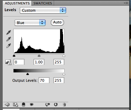
Step 9: Last step... adding a bluish tint to the shadows. This is an option and may give it a more retro, film feel. Add a new adjustment layer, and position it below the original Levels Layer. Choose Blue from the Drop Down Menu and move the black triangle on the bottom slider to about 70 or so.
Here is my final image.

Here is another version where I added a vignette.

I'd love to see some of your photos and how they turned out!
Hope you enjoyed this technique... and thanks for visiting!
Jenn (jk703/The Typative Scrapper)
One of the great photography techniques is cross processing. It gives pictures a fun retro feeling that can be gorgeous, different, and striking all at the same time. Before digital photography (in the dark room) film was processed using chemicals. Different types of film needed different sets of chemicals. Slide film needed one set, a different set was needed for black and white, another for color . . . and so on. If you used certain chemicals with a different film, many times the photographs had both a high contrast and a color cast to them. Cross Processing itself is the procedure of deliberately processing film in a chemical solution intended for a different type of film. Although working hands-on with film is not something many digital scrappers do, we can achieve the effect using Photoshop.
The color cast actually looks quite artistic. There are many photographers that have made use of this processing to deliberately create an artistic look to their photographs. The look has become more popular recently because it's found its way into magazine advertising and for artistic wedding photography.
Here is one way to achieve that cross processed look:
Step 1: Open and re-save your photo with a new name. You can always pull the original if you need it. Here is my photo cropped:
Step 2: Duplicate your image using Control/Command J. Then on your duplicated image, run the Image > Auto Contrast.
Step 3: Add a levels adjustment layer by clicking on that button on the bottom of the Layers Palette. It looks like a half white/half black filled circle. Once the levels adjustment layer opens, you will be changing the color and sliders. From the drop down menu, choose Red. There are top sliders and bottom sliders. Now, slide the white triangle on the top slider to approx. 200. The bottom black triangle on the bottom slider should be moved to 200 also. Red is done.


Here is what your photo should look like after this step:
Step 5: Choose the Gradient Tool. Most cross processed photos look as if the light leaked in on one side or in areas of the photo. You can also access this tool by pressing "G."
Step 6: Click on the rectangular gradient on the Tool Options bar. A menu will open. Choose the first one, called Linear Gradient, which is a gradient from the foreground to background color. Press "D" to reset the color palette to the default black and white.
Step 7: Click, drag and release. You will click on one spot on the photo, hold down the mouse button and drag in another direction, and then release the mouse button. Make sure that the Levels Layer in the Layers Palette is active when doing this. Your first click will receive a full level of the adjustment layer, while the dragged areas will receive a gradient of the adjustment.
Play around with this step. Try click, drag and release in a diagonal line, or with a longer drag, and don't forget a really short drag. The look of your picture will turn out differently every time.

Short Drag:

Opposite Drag:

Diagonal Drag

Step 8: When you find the gradient treatment that you like, you can adjust its intensity with the opacity button. On my example, I lowered it to about 67%. Find what appeals to you.
Step 9: Last step... adding a bluish tint to the shadows. This is an option and may give it a more retro, film feel. Add a new adjustment layer, and position it below the original Levels Layer. Choose Blue from the Drop Down Menu and move the black triangle on the bottom slider to about 70 or so.
Here is my final image.

Here is another version where I added a vignette.

I'd love to see some of your photos and how they turned out!
Hope you enjoyed this technique... and thanks for visiting!
Jenn (jk703/The Typative Scrapper)
Sunday, October 30, 2011
Tutorial: Content Aware
Photos that we take during our travels are always perfect, right? No way, at least not for me! I usually end up with someone in the background, a hand off to the side, or even a bird in the wrong spot. Whatever it is that has marred your photo, you can try to remove it. There are many options in Photoshop and Photoshop Elements, such as the Eraser Tool, Spot Healing Tool, and the Clone Tool. Photoshop CS5 or Photoshop Elements 9 and up offer a cool new feature to remove unwanted "pieces" of your photo: Content Aware. Content Aware is a function that, while not perfect, can really improve your photos with a little tweaking and patience. This single feature allows you to edit your photos without the visual signs that the edits were completed. Give it a try on a simple removal in one of your photos and you might surprise yourself!
Step 1: Open your photo in Photoshop, and be sure to save it as a new document. Here is my son, Shayne, climbing up the slide. You can see his little brother, Colin, in the background in blue.
 |
Step 2: Choose the Lasso Tool and click around the item that you will be removing from your picture. Here is a close up of Colin and what I plan to remove from my photo. I stayed relatively close to the edge so I don't remove other parts of the photo that I want to stay.
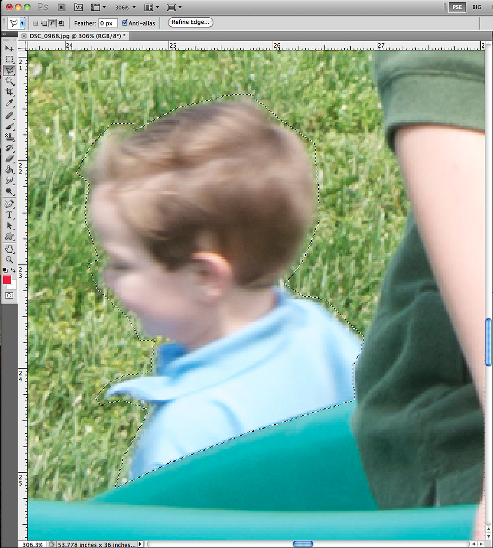
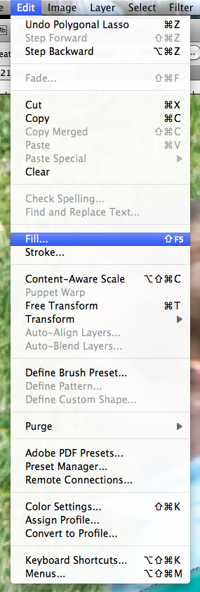
Step 3: Choose Edit in the toolbar, and then click on Fill.
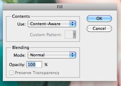
Step 4: A menu will pop up before you can continue. Within this menu, click on the drop down arrow under "Contents:" and "Use:" and choose Content-Aware. Click Ok.
Step 5: Here is a close up of the Content Aware fill that the software generated. Not too bad at all! Since I have played around with the Content Aware feature, I have found that sometimes there is a need to complete the fills by making a new selection and using the tool again (or maybe a few more times).
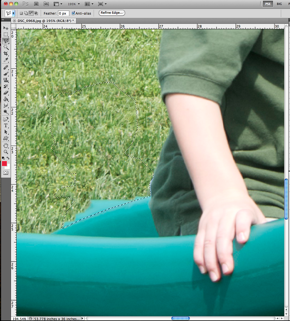
Step 6: Since I still have a jagged edge on the green slide, I will run a Content Aware Fill again by following the same steps as I did previously. If you need to complete a second round of the fill, you will press Control-D to deselect the area. Then begin again at Step 2 with the Lasso Tool. Here is my second go round of a Content Aware fill with the image from Step 5.
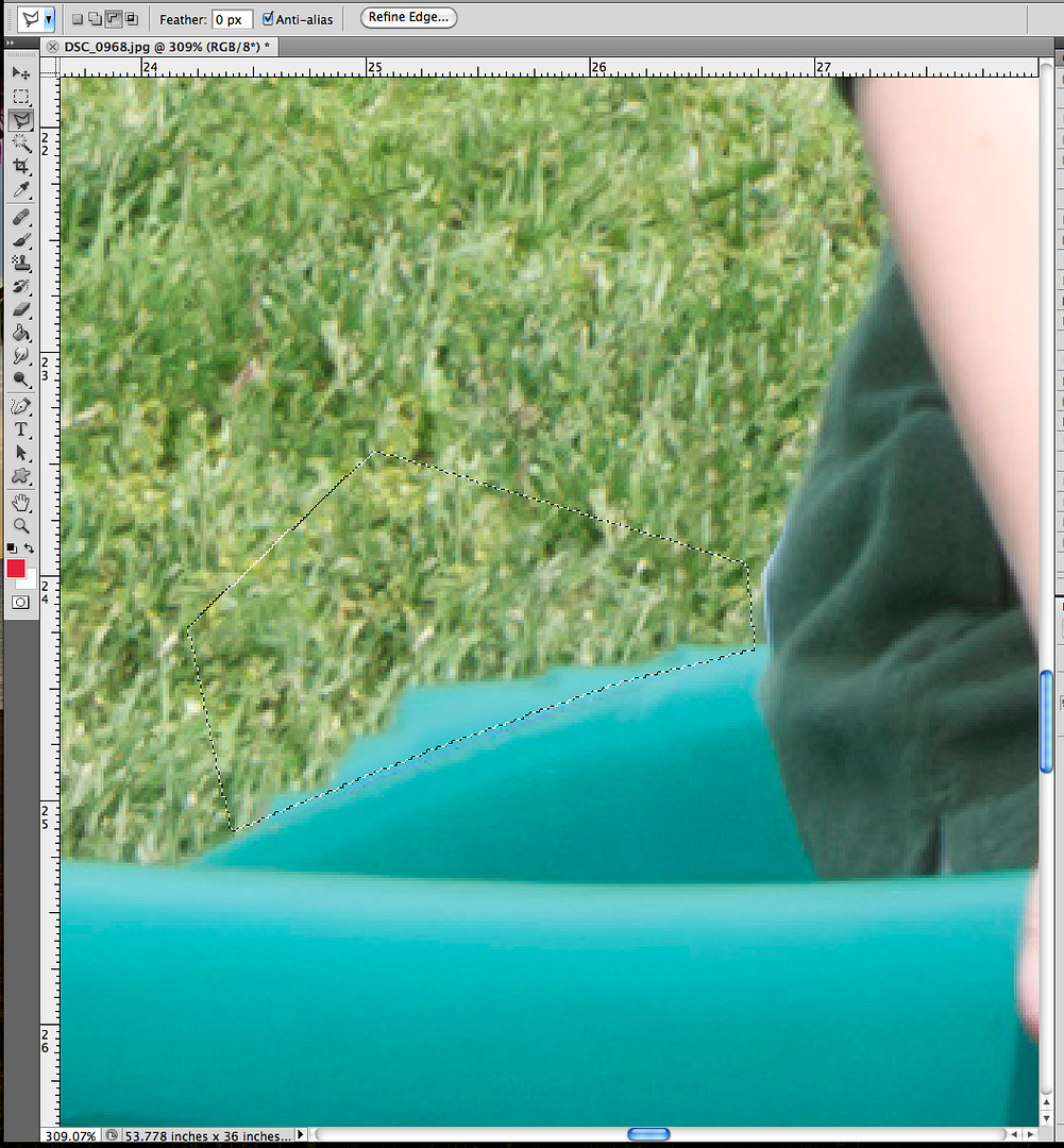
Step 7: I like my image, but I am one who likes smooth edges and a continuous look. I decided to try using the Content Aware one last time. Here are my final results, still a little jagged, but after I zoom out, it will look great!
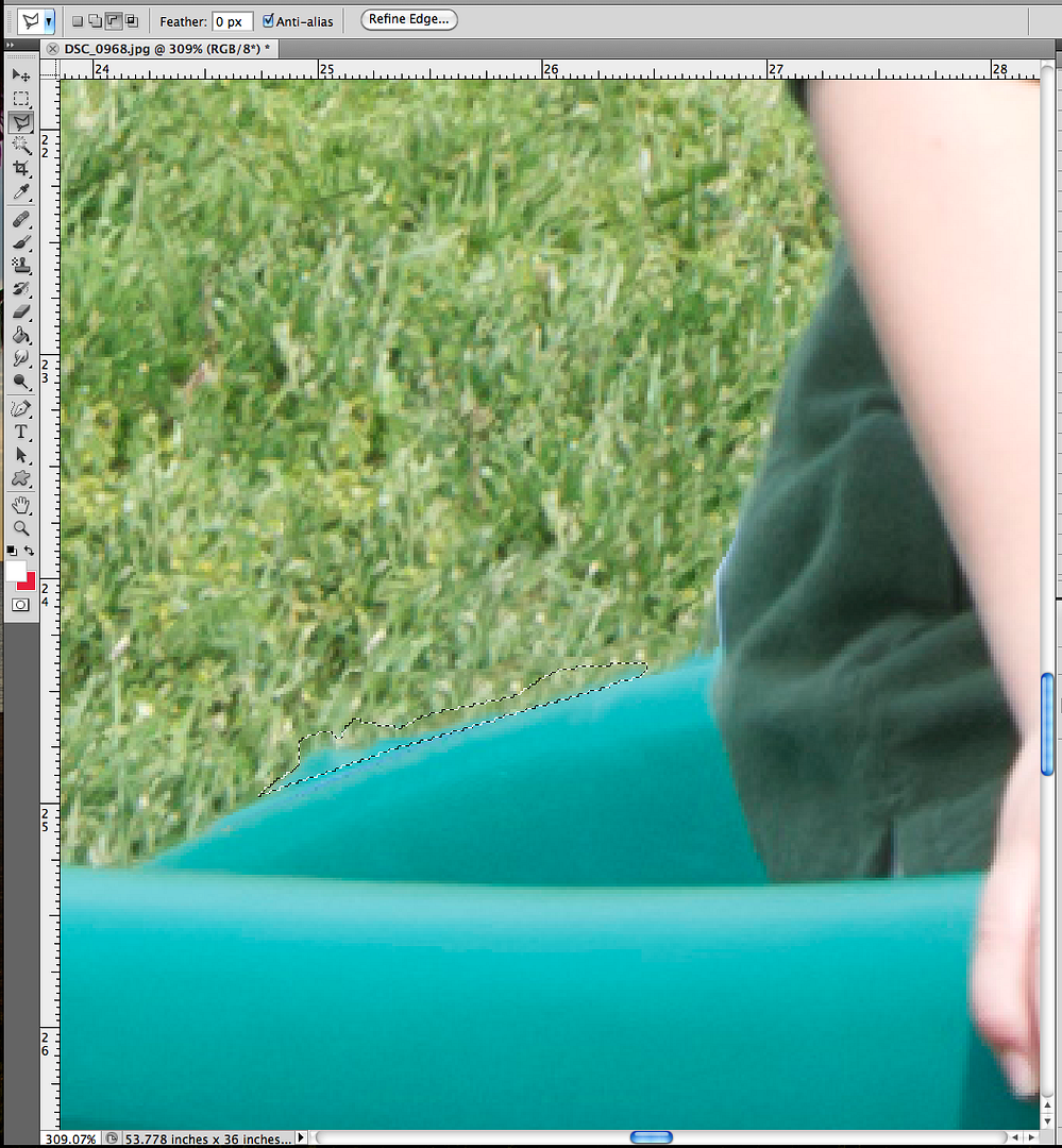
Final Image:

Remember, Content Aware is a feature to help make your photos better; it cannot make them perfect. I showed a picture that used multiple steps to remove the unwanted portion. You have the ability to step back or "undo" what you have filled in, so there isn't a worry about damaging your photo memories. Not all pictures will be difficult; some may be easy. Here are a few before and after photos with easy Content Aware removals.
Before, with a dock piling:
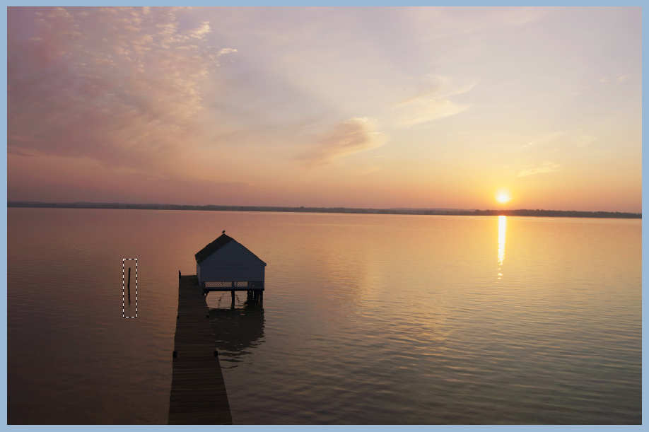
After, dock piling removed:
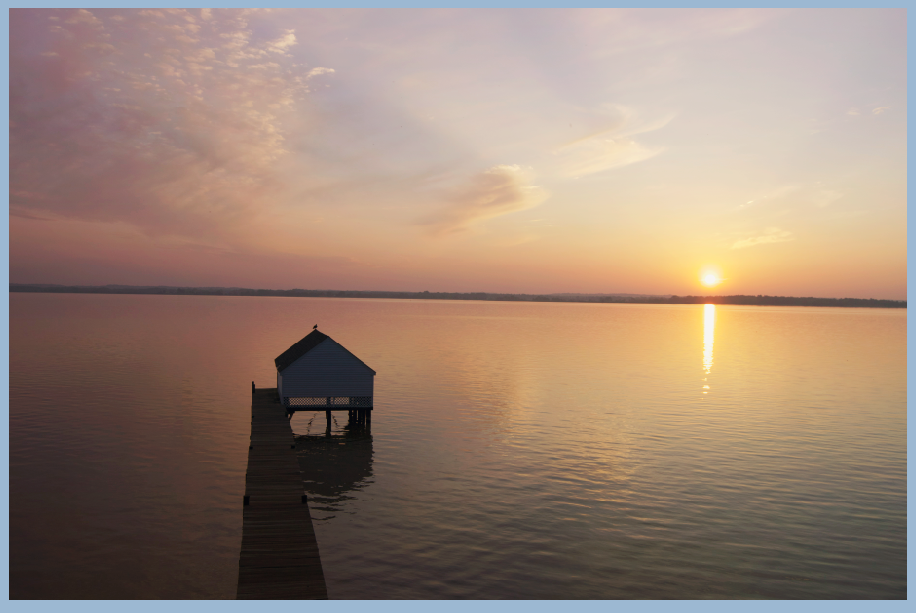
Before, fence and cell tower:
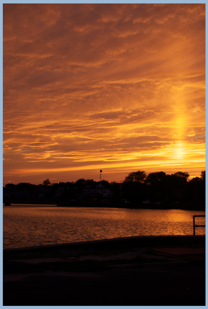
After, fence and cell tower removed:
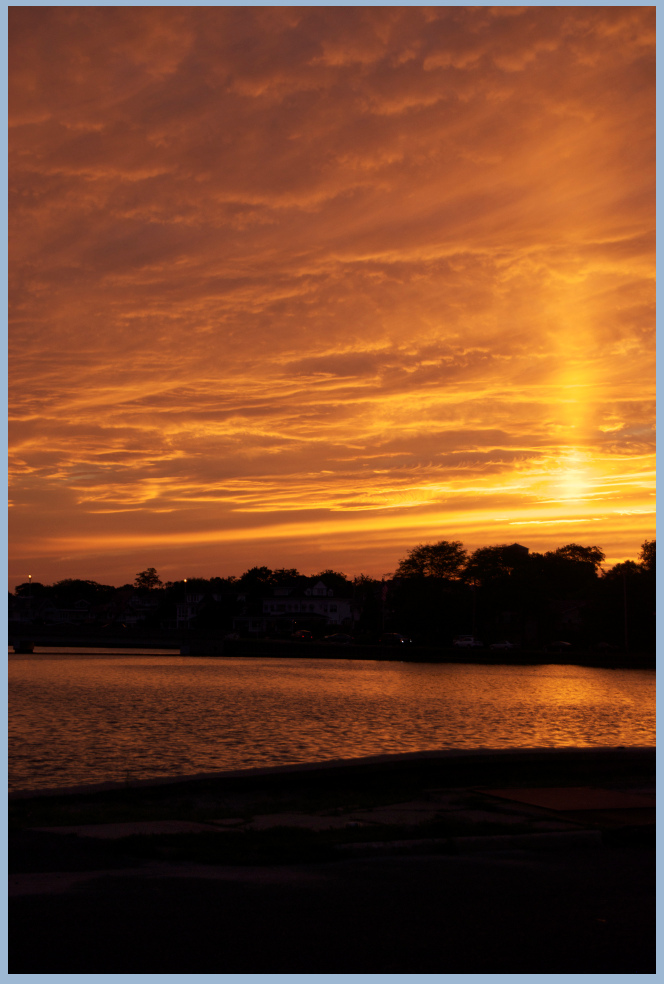
There you go! Hope that helps removing some of those unwanted background items! I originally wrote this article for the ScrapMatters Quarterly Magazine!
Thanks for visiting!
Jenn (jk703/The Typative Scrapper)
Saturday, October 15, 2011
A YUMMY Unsharp Mask Tutorial
Ohhhh Digital Scrapbookers! Check out this great step for your photo and digital scrapbooking needs! Hey everyone -- Today, I'm going to show off a really EASY step to help make your photos and scrapbook pages look fantastic.
First things first - save your photo and open a copy in Photoshop or Photoshop Elements. You don't want to ruin your photo and by using a copy, the original is there if you need it! Here is a picture of the Pineapple Salsa that I made one evening this summer! But sadly, my pinapple salsa looks a little mushy and not too yummy! So... let's make it look a little better and sharper!

Now, up in the Menu Bar, click on Filter > Sharpen > Unsharp Mask.

Next, the Unsharp Mask sub menu will pop up. Move the sliders on the Amount, Radius and Threshold until your preview image looks how you want it to appear! To see the preview image, make sure that you have the Preview box checked.

Here is my final image. Looks a little less mushy, and the sharpness helps differentiate between pineapple, onions and the peppers.

This can also be used on your digital scrapbook pages before you save them for the web. Gives them a little sharpness to them!
Originally created by me for Scrap Orchard - HERE!
Have a great day and thanks for stopping by!
Jenn (jk703)
Friday, September 30, 2011
Vibrance Tutorial
Hi Everyone! Hope you are all having a great start to your weekend! So, for my tip today, I'm going to share a little secret to adding a little vibrance to your photos QUICKLY. We are always trying to do things faster, and that works with our scrapping too! Here we go...
Here is my original picture opened in Photoshop. (I use CS 5)
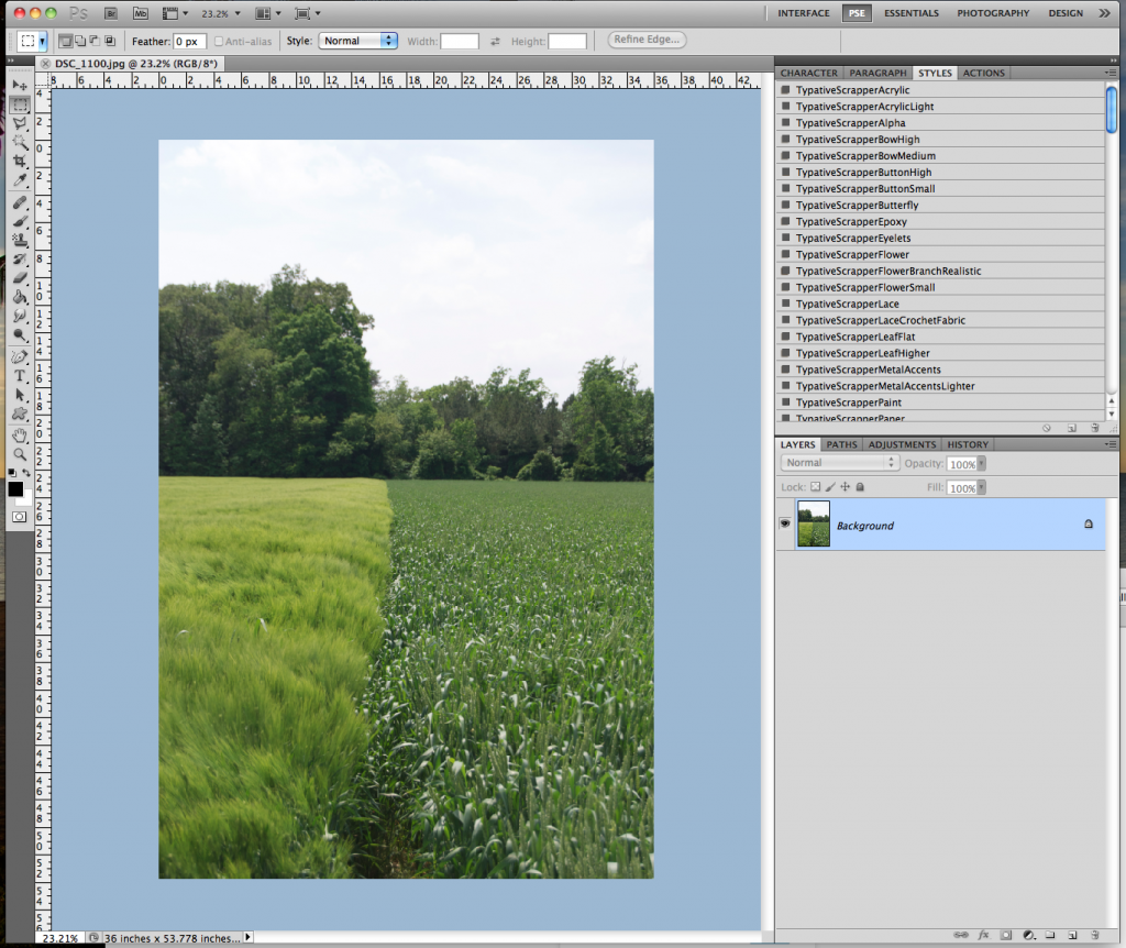
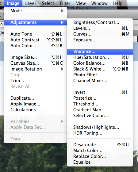
Now, in the Menu Bar, I choose Image > Adjustments > Vibrance.
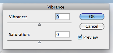
Next, a small pop up menu will appear. It will have sliders marked Vibrance and Saturation. Slowly move the sliders to the left and right. If you have the Preview box is checked off, you will be able to see the changes in your image as you are sliding the cursor.
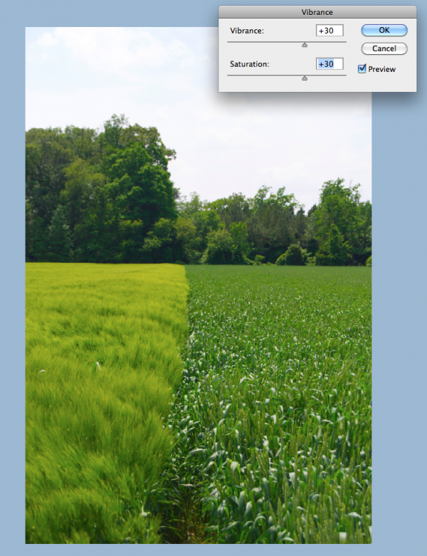
I moved my sliders to the right, and increased the vibrance and saturation. Play with them at different settings, and see what you like! A quick and easy way to add a little pop to your photo.
Thanks for stopping by and checking out a quick tip! Hope it added a little vibrance to your day!
Originally created by me for Chelle's Creations: HERE!
THanks for stopping by! Come visit soon!
Jenn (jk703)
Here is my original picture opened in Photoshop. (I use CS 5)
Now, in the Menu Bar, I choose Image > Adjustments > Vibrance.
Next, a small pop up menu will appear. It will have sliders marked Vibrance and Saturation. Slowly move the sliders to the left and right. If you have the Preview box is checked off, you will be able to see the changes in your image as you are sliding the cursor.
I moved my sliders to the right, and increased the vibrance and saturation. Play with them at different settings, and see what you like! A quick and easy way to add a little pop to your photo.
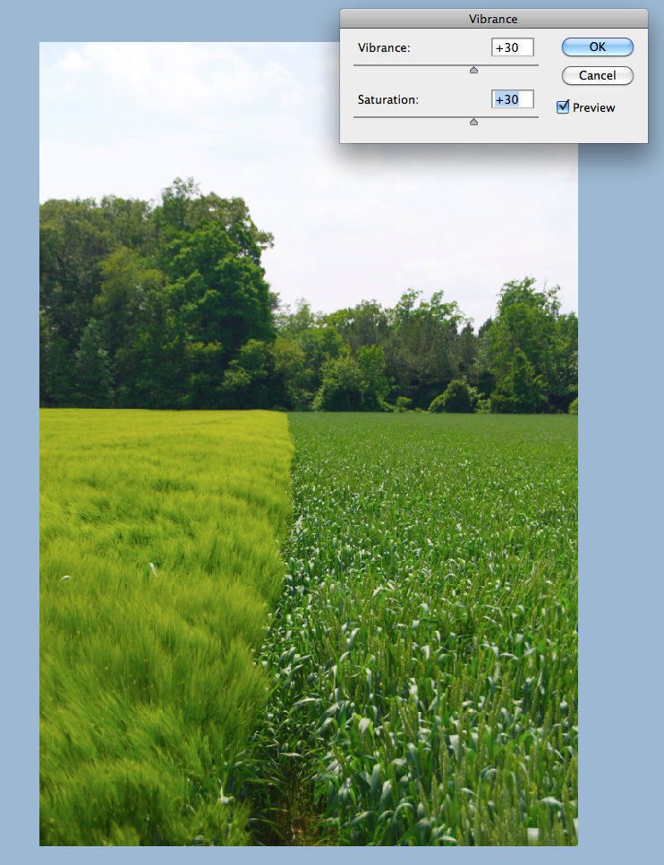
Thanks for stopping by and checking out a quick tip! Hope it added a little vibrance to your day!
Originally created by me for Chelle's Creations: HERE!
THanks for stopping by! Come visit soon!
Jenn (jk703)
Wednesday, September 28, 2011
Black and White Made Easy
Hey Everyone! It's Hump Day! Yay! I hope that you are ready for the upcoming weekend! It will be October!!! Today, I decided to make my post about a quick How-To for Black and White Photos. The weekend will be a perfect time to try out this technique. It's not too difficult and can really make your otherwise dull black and white photos pop!
Black and White, otherwise B&W, can be a way to create a striking photo and bring a lot of contrast to your digital scrapbooking layouts. Here is my starting photo - a pretty flower I snapped while on vacation this summer. It is a very bright photo and I love the
perspective.
perspective.
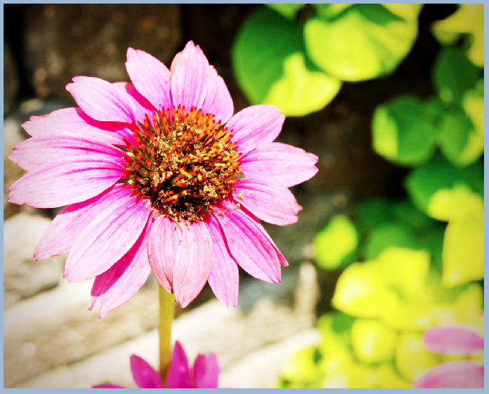
Let's say that I am making a layout also with bright colors in the papers and elements, but I really want to use this photo. Instead of a too busy or too colorful page, I want to create a focal point on my layout. To make the photo pop, I am going to make the photo B&W.
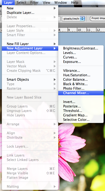
First, remember to save your image before completing your edits so you will always have the original photo if you ever needed it. Next, with the photo selected, in the Menu Bar, click on Layer. Scroll down to New Layer Adjustment, and choose Channel Mixer.
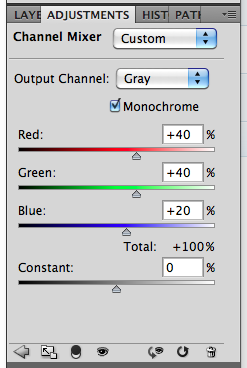
The Adjustment Palette will pop up (mine is within my Layers Palette, just another tab). You will see a few slidebars, and a small box that is for Monochrome. Click this box and make sure there is a check mark ticked.
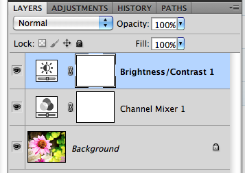
Your photo will turn to an instant Black and White. But wait... there's more... Again, in the Menu Bar, click on Layer > New Adjustment Layer > Brighness/Contrast. Here are the options available to you in this particular adjustment.
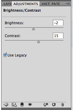
When you look at the Layers Palette, you will now see another new adjustment layer. By tweaking the contrast, your photo can become a little more sharper and really jump off the page. Here is my after picture below. See how the center of the flower is a little more focused and the edges of the shadows are just a tad deeper.
Here is my final Black and White Photo.
 There you have it - an easy way to make a photo black and white! Plus, the know-how to tweak the brightness and contrast to your own liking! Enjoy your pictures and make
them pop off the page!
Originally created by me for Chelle's Creations: HERE!
Have a great day, and thank you for stopping by. Come back soon!
Jenn (j703/The Typative Scrapper)
Thursday, September 8, 2011
Filter Focus: High Pass Filter
Hi Everyone... I'm here to show a sneaky easy peasy tutorial to sharpen with a slight pop for your photos! Plus, we are going to learn another filter that is available in Photoshop and Photoshop Elements. We are going to look at the High Pass Filter today...
The High Pass Filter adds a little pop to your photos within seconds and is really easy. The filter allows you to control the awareness and emphasis of the edges of objects that are in your photos. It is also used to sharpen your photos when they might just be a tad out of focus. Here we go...
Here is a Colin... my model for this tutorial! lol! My image is unedited and hasn't been processed at all.

1. First, save your image so the original will be available in case there are any problems. Duplicate your photo onto a new layer. (PC Ctrl-J and Mac Cmd-J).

2. Working on the new layer, choose Filter > Other > High Pass.

3. Set the radius of the pixels somewhere between 3 and 12. Click on Apply. I know that is a large range, but play with it, you can always undo! For my example, I used a radius of 4.7.

4. Now, in the Layers Palette, you are going to change the blend mode of the duplicate image, the one that is grayed out. Choose Overlay.

5. Play with the opacity of the overlay, and you will see slight differences in the edges in your photo. This brings out some of the color and allows for an easy simple pop.

Tips:
- To sharpen the photo without a color pop, try the Soft light or Hard Light blend modes.
- Adjust the sharpness based on what you will be doing with the photo - print or web versions.
- Try creating different layers, and changing the blend modes, and opacity to see what you like the best.
- Try it out on your layouts before uploading to the galleries! A little sharpness goes a long way!
Another example is my sandwich, yes... my life-like magnet sandwich! Looks realistic, right?!
Before High Pass:

After High Pass:

See the top of the sandwich and edges -- they are a little more defined with just a tad of a pop added to the color.
There you have it - an easy pop and sharpen! Hope you enjoyed this tutorial! I'd love to know what you want to see here on Chelle's blog - so be sure to tell us in the comments! Enjoy the rest of your week!
I created the original post for Chelle's Creations.
Thanks for visiting!
Jenn (jk703/The Typative Scrapper)
Subscribe to:
Posts (Atom)