Friday, March 25, 2011

Antiquing: Digi-Style

Antiquing is a technique that is growing in digital scrapbooking - largely due to the popularity of everything vintage! Many people use scanned or vintage photos in creating their layouts, but what if you have a photo from today that you would like to make look older? Trying out some reverse photo restoration is a fun way to play with photo editing. And what if you could use your digital scrapbooking stash to do it...even better, right? There are so many easy possibilities! This tutorial will teach you how to combine your photo-editing software and some digi-scrap goodies, to end up with an "antiqued" photo for your layout. Keep in mind, this is just one of many ways to do this in Photoshop, this is just one.

First, open your photo in Photoshop. Then, create a duplicate layer (Control + J), so the original is still available to you if you need it! I will turn the Background layer off of my view. I named my duplicate layer Picture 1.

Next, choose your crop tool, and crop your photos to a square or rectangle. Many old photos were square - though this is optional. 

The next step is to desaturate your photo. Choose your Picture 1 layer, and then Image > Adjustments > Desaturate. This will make your image a greyscale.


Click on your Picture 1 layer in the Layers Palette, and then: Filter > Blur > Gaussian Blur. You want to blur the picture enough that some of the detail goes away, but so that you can still see what it is. My setting for this example is 1.5, but play with the pixel range until it is visually appealing to you. 


Next, create a new layer on top of Picture 1 and name it Noise. Fill this new layer in with black. With the blackened Noise layer selected, go to: Filter > Noise > Add Noise. The percentage should be around 125 - 150% -- we want lots of noise and then we can quiet it down to a comfortable level of noise! Also, make sure that Gaussian and Monochromatic are selected. In the Layers Palette, select the Noise Layer and change the blending mode to Soft Light. Lower the opacity of the layer to what you like for your photo. 


Now, I've imported a mask and overlay from Happy Scrap Girls Worn Out Overlay's Volume 6, and a paper from Laitha's Designs, Light Grunge: Set 1. These are awesome tools to make any picture look older, or gently loved! Move the layers around in the Layers Palette to the following, top to bottom: Light Grunge Paper, Overlay, Noise, Picture 1, Mask, and Background. For my example, I've clipped everything to my picture, and then started playing with the blending modes and opacity. Specifically for my picture I have the following:

Picture 1 -- Normal Blending, and 90% opacity
Noise -- Soft Light Blending and 30% opacity
Overlay -- Overlay Blending and 100% opacity
Paper -- Linear Burn Blending and 44% opacity


Each blending mode and layer opacity can change the whole effect, so play with it. You might also try to create a second copy of your picture and leave it in color. When you do that, you could have a colorized old photo look! Here is an example of the desaturated photo and then the same photo with a color version of the antiquing.


Changing your pictures and using your digital supplies on them really allows you to use your stash in a whole new way! Any paper will give you a whole new look with a fun blending style used. Adding a texture will show off the photo. Give it a try -- you might find a new technique to love!

Some other cool overlays, textures and papers to use these techniques with are:


Links to products used: 
Laitha's Designs - Papers:http://shop.scrapmatters.com/product.php?productid=7642&cat=0&page=2
Happy Scrap Girl Overlays: http://shop.scrapmatters.com/product...5&cat=0&page=1

This article was originally created by me for the ScrapMatters newsletter!  Sign up today for a fantastic always over 20 page inspiring monthly newsletter: HERE!  


Thanks for visiting!
Jenn
(jk703/The Typative Scrapper)

Thursday, March 24, 2011

Project 52: Catch Up, lol... not Pick Up! :)

Hi Everyone.... Just a quick pop in today to show off my recent Layouts for P52.  I am so nutty at work lately, and with only so much time, blogging has slid a little... but I'll be sure to post some more layouts and tutorials soon!  Share them... someone might learn something!  :)

I last showed off Week 1... so now to show off Week 2, and 3!  Here you go!


Week #2 used the following supplies:  Fiddle Dee Dee -- Verbosity Album,  Geek Chic Scraps and Spinky Dink Scraps -- Tell Me About It Kit,  WM [Squared] -- Vintage Summer Alphabet, and the font is Earthquake Typewriter. Photo Action by Paint the Moon.  Note: Scrap Goodies in my picture are from Chelle's Creations and Stampin Up!


Week #3 used these yummy goodies: Jennifer Labre Designs - Winter Wishes and Fiddle Dee Dee Designs - Fuss Free Day by Day: Set 1(was at ScrapMatters, will hopefully be moved to The Digichick soon!) & Fuss Free: Square Pegs.  


It sure seems like snow and winter are the main themes of my pages, but we've gotten so much snow that I am done with winter for the next 5 years!  Really... it is March now... and guess what, we got snow today!  Hello... spring has started!  Hopefully I will get some spring shots for my P52 soon! My main theme for my P52 is simple.... fun pictures, a bit of journaling and paper blocking.  I wanted to keep it easy, no stress and fun to scrap!  I may be behind, but I am doing it and enjoying it!  


I'll be back with Week #4 and Week #5 which are done... sometime this weekend!  


Thanks for visiting!
Jenn (jk703)


Tuesday, March 15, 2011

Brusha, Brusha, Brusha! lol!

Hi Everyone!  Hope your week is going great!  I'm here today to share more information about the Brush Tool in Photoshop.... but before I do... lets go over some of the basics!

About the Brush Tool and the Options

First, you need to start a new document, layout or an existing project. You will select the Tool Brush from the tools toolbar.  This is what the Brush Tool is, and what other tools are available. 

The Options Palette on the top looks like the picture below... and is pretty easy to use. You can change the size of the brush, as well as play with the hardness of the brush that you will use. When you change the number of pixels of a brush, you are changing the Hardness.  A higher number on the Hardness slider will make the edges on your brush more defined.  A lower number on the Hardness slider will make the edges on your brush less defined. 


On the Options palette you can choose the Mode that you want the brush to have, the actual stroke.  The Opacity percentage will change the opacity of the brush stroke. Lowering the percentage will make the brush stroke more transparent, while raising the percentage will make it less transparent.  

There is also a button for Flow.  This allows you to select how much paint will come out of the brush when applied to your document. The higher the flow, the more paint, as well as the lower the flow, the less paint used when you click your mouse.


There is also an Airbrush feature available. This allows paint to come out of the brush the whole time you are moving your mouse.


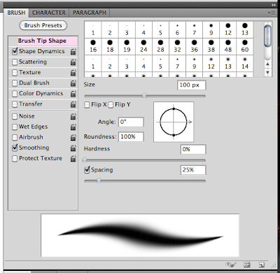
If that isn't enough to learn... there is a whole nother menu under the brush presets. This is what that menu looks like:  


There are a lot of setting here, but many are pretty self explanatory -- as long as you play with them, try them out, and experiment. Here are some of the options in this menu:
  • Brush Tip Shape -- determines the main shape of the brush. 
  • Shape Dynamics -- allows you to modify the shape of the brush.
  • Scattering -- this option determines how closely the brush marks are to the stroke. This can add a nice randomness to your stroke. 
  • Texture -- Adding a texture to your brush can really show some depth. Photoshop allows you to apply any of your Texture presets to your brush. 
  • Dual Brush  -- Combining two different brushes using the Dual Brush option can really create some fantastic effects - unavailable if you were only using one brush. 
  • Color Dynamics  -- this option allows for modification of the color of the stroke.  Playing with this will allow you to create some interesting color variations.  
  • Noise -- Creates random noise within your brush shape.
  • Wet Edges -- If you keep the edges of your brush at the highest opacity, and lowering the inside of your brush's opacity will create a similar look to watercolor, hence the Wet Edges.
  • Airbrush -- works with Flow, that is on the Menu bar above. 
  • Smoothing -- Smoothes the curves of the stroke.
  • Protect Texture -- This can allow you to make sure the same texture is used for every brush with a texture.
Brush Tool Shortcuts:
  • B -- Brush Tool
  • Shift + B -- Rotate through Brush tools (i.e. Brush, Pencil, etc)
  • F5 -- Show or hide Brushes palette
  • [ -- Decrease brush diameter
  • ] -- Increase brush diameter
  • Shift + [ -- Decrease brush hardness by 25%
  • Shift + ] -- Increase brush hardness by 25%
  • , --  Previous brush
  • . --  Next brush
  • Option (hold) --  Temporarily switch to Eyedropper tool
  • Shift + Option (hold) -- Temporarily switch to Color Sampler tool
  • Command (hold) -- Temporarily switch to Move tool
  • Command + Option (hold) -- Duplicate and Drag layer
  • Space (hold) -- Temporarily switch to Hand tool
Now for something quick to teach you a fun way to use the tool!  We are going to add some really basic watercoloring to a paper.  I've used a piece of paper from Jennifer's Tomorrow's Another Day Kit to show off my example. 

First, you will open the paper in a separate document and apply the shadow style you would like. Next... Command and Click on the Notebook Paper, so you see the marching ants. 

Click on Layer > New > Group. Then click on Add a Layer Mask, which is this little button
on the layers Palette. Create a new layer above the notepaper. 


First, I am going to select the Pencil Tool within the Brush tool, change the opacity to 30% on the menu bar options, and make my brush size about 125 pixels.  Drag your cursor over the paper to areas you want to add watercolor to. This is brown added:


Next, I did the same technique, changed up the opacity and brush sizes, and added faint Pink and Green layers.  I also played with the blending modes of each color layer.  My favorites are Multiply, Linear Dodge, Linear Burn... you have to play with them all!  Here is what I ended up with. 


Now, think of what you could add... doodles, coffee stains, textures, splatters... so much more! I've only barely touched what the Brush Tool is all about or what it can do!  I hope that you might have learned something today!  

Originally created by me for Jennifer Fox Designs: HERE!

Thanks for visiting!  
Jenn (aka jk703/The Typative Scrapper)

Monday, March 14, 2011

The Painless Education: Font Facts

I everyone... I'm back!  I decided to start to share a little knowledge -- easy to understand, painless, learning! These are things that I find useful! I just hope that you do too! I've recently been working with a lot of alphabet sets, and fonts in my layouts and that got me thinking! I don't really know much about font, the types or basic info. I do know that I like to use fonts on my layouts for titles, journaling, or even a little creative background. There are THOUSANDS of fonts out there, so many to choose from - it is such a big part of digital scrapbooking today! So, I'm going to share what I found on my little crash course in FONTS!

Typeface or Font? 
Many people are often unsure of the difference between these two, as it seems that the terms are both widely used. To clear it up, my basic understanding is that a typeface is a family of fonts (such as Helvetica Regular, Helvetica Italic, Helvetica Bold, Helvetica Black, etc.). A font is one weight or style within a typeface family (such as Helvetica Regular). When I looked it up, font was defined as: a noun, is basically defined as an assortment or set of type or characters all of one style and sometimes one size. I have found there are three basic font types or classifications: Serif Fonts, Sans Serif Fonts, and Decorative Fonts. There are numerous classifications, but those seem to be the most common.

A serif font is one that has the little line at the top or bottom of a font such as: Times or Garamond. These lines are supposed to help to keep your eye moving along the page.

Fonts without serifs are called sans serif fonts (literally, “without serif," isn't that the most ingenious name? lol). The most common sans serif font is Arial.

Decorative fonts are for, well, decoration. These are the fancy fonts that are designed to make a visual impact rather than to be easily read. Fonts that look like cursive script or handwriting fall into this category! These are the ones that I find most often on my layouts! Here is an example of one by Larabie, called Minya Nouvelle:

Some great resources for fonts, free and paid:

As I was roaming around the internet, I found a fun, cool quiz that you can take!  I would love to know "What Font Are YOU?!"  Here is a link to the quiz, from PBS:

Another fun site to check out is Wordle.  Wordle is text that you've typed in, turned into a "word cloud."  Try it out -- it's fun and pretty cool! You can mix it up, color and font choices too!

Share your favorite font sites, or even the font themselves!  I love them!  Thanks for visiting!

Created originally by me for Jennifer Fox Designs: Here!


Thanks for visiting!
Jenn
(jk703/The Typative Scrapper)

Saturday, March 12, 2011

Day 26 & 27: Family, Pets and Tears

Hi Everyone!  I'm back... lol... like I'd be anywhere else!  *giggle*  So... I'm up to Day 26 and Day 27 of the 30 Day Bloggity Blog Challenge -- to which I fell off the wagon, and recently got back on!  :)

So... Day 26 is a family picture... lol... I have to go search!

Wait... Be right back...


One More Minute...


ok....


well...

The last picture that I have as a family is from last summer, lol! Didn't realize how horrible I was at getting group shots!  That sure is going to change!!!  So... I will share a family picture at least of the 4 of us, and then a layout of Peter and I... :)

As you can see... Shayne didn't want to take a picture, so he looked away at the last minute!  Oh well... lol!  Plus, don't mind me...we were away for the weekend, and were going to drive home for a nice 5 hour long trip so I hadn't done my hair or much makeup!  :)

Here is Peter and I from my cousin's wedding... with the sun in my face and my hair blowing in the wind... Oh Puleez!  lol!  The second page to this layout was with my parents... they are below Peter and I.

Delightful Day Elements and Papers by Spinky Dink Scraps
Fuss Free: Contest Series 2 by Fiddle Dee Dee Designs
Fonts are Film Cryptic and Jane Austen Fonts

I used Spinky Dink Scraps and a template from Fiddle Dee Dee Designs for this layout and it was such a cute/classy kit to work with, plus an awesome template!  Kind of like the best of both worlds!  


Next up.... well. Pets.

Hmmm.. I don't have much to say.  It is a tough one, and makes me sad still.  

I've only copied and pasted my explanation from FB to here.  I try not to dwell as I will become sad and still very upset.  Just explaining this and posting this brings tears to my eyes and that lump in my throat.  I am still unable to do the second page, even though the words below ARE the gist of the second page. 


I copied and pasted from my FB page...

The background... The will be the first page of a layout. I can't do the second page yet -- I don't have the "right" words.

Mack, my furbaby, was starting to snap at Colin, and growl if he came near. Then when we were not home, he started damaging the house, clawing at the drywall, door trims, and having accidents all over the house. We tried so many things... One afternoon, Colin was crawling around, and was near Mack, and Mack snapped at him, and almost got him.

We had to make one of the hardest and saddest decision of our life. We had to bring him to the shelter. We couldn't take any chances with our children. It made me feel like the worst person/pet owner in the world.

I will never get over him, and our situation... I can tell you my side of the story so many times, but the guilt will never go away. There are always the thoughts of "I should have done this or that"... I miss Mack so much!

Thanks for looking, and reading my novel.
I chose this odd photo because it was my favorite.


Designer Digitals:
Anna: ArtPlay Palette, Find My Way,
Katie: Web Inspiration Challenge.

Font: Scriptina


ok... deep breath... 

moving on.  


Thanks for visiting!
Jenn (aka jk703/The Typative Scrapper)

Friday, March 11, 2011

Shuffle It Up... Day 25!

Hi Everyone... a quick post here to keep myself going... :)!  


Today's post is my Ipod... shuffle up the songs, and jot down the first 10 songs... I have such a range in music that this will be interesting!  lol!  Here goes... 


1. Sugarland -- All I Want To Do... 
2. Kenny Chesney -- Better As A Memory...
3. Nickelback -- Never Going To Be Alone... 
4. K'naan & Adam Levine -- Bang Bang... 
5. Bon Jovi -- I Love This Town... 
6. Nelly -- Just a Dream...
7. Theory of a Deadman -- So Happy...
8. Toby Keith -- Get Drunk and Be Somebody...
9. Pink -- Raise Your Glass...
10. Good Charlotte -- Like It's Her Birthday... 


Country, Rock, Pop, Rap, Dance... hmmm... lots going on there!  That was fun!  


The other funny thing... I wonder why the kids songs didn't invade the first 10 -- I have Disney, They Might Be Giants, Cars, and other wonderful kid (*rolling my eyes*) tunes!  Some are ok, but boy... sometimes I have to wonder what someone was on when writing kid songs!  


Thanks for visiting!
Jenn (jk703)

Wednesday, March 9, 2011

Resize and Scale Smarts!

Hello everyone! Today I'm here for a quick post about resizing/scaling photos, or digital scrap items. My card example below uses Chelle's awesome baby bundle:Beary Cute Baby Boy Combo, and some Stampin' Up paper supplies.


Re-sizing....
I always have to re-size photos, and many time the elements that I include on my layouts. Going larger, going smaller... I want to make sure I resize correctly. This is an incredibly easy subject for Photoshop users, but I sometimes see layouts that have skewed images or elements.

First, to resize images in Photoshop, you first want to make a duplicate of the original photo so that you can always re-use its original size if need be. You can do this quickly by selecting Image > Duplicate in the menu bar. If you don’t duplicate, you can select File > Save As to save a copy of the resized image.

To resize and image, click on Image > Image Size. This will bring up the Image Size Menu, and show you all the little features for this function.
The Image Size Menu box is divided into two main sections - Pixel Dimensions and Document Size. Another important part of this box has to do with constraining the proportions and re-sampling the pixels of a selected image. When you change the width of the photo, Photoshop will automatically adjust the appropriate image height. If the Constrain Proportions is not checked, the dimensions of your image might become skewed.
Here are some basic facts about re-sizing:
  • If you change the pixel dimensions, then you will affect the physical size, but not the resolution.
  • If you change the resolution, then you will affect the pixel dimensions, but not the physical size.
  • If you change the physical size, then you will change the pixel dimensions, but not the resolution.

There's something you need to keep in mind though when it comes to resizing your image and image quality. The basic idea is that it's usually okay to make your image smaller without losing much in the way of image quality. However, many times you will lose image quality if you try to make your image larger.

Scaling...
One of the most basic transformations Photoshop is capable of is scaling. Scaling allows you to enlarge or contract, say an element around a reference point. To scale a graphic, we go to Edit > Transform > Scale. A set of handles will appear around our selected layer. By moving anyone of these handles, we can adjust the size of the object. To apply the transformation, hit Enter.

Most times it will be necessary to constrain the proportions of your images when scaling. We don't want to change the size of the image, and end up with skewed images. This can be achieved by Holding Shift while dragging one of the handles. You can also scale from the center reference point by Holding Alt (Option on Mac), or combine the two by holding shift and alt at the same time while scaling. The little chain links in the menu bar can be clicked to keep the proportions correct.

To Rotate an Object in Photoshop, go to Edit > Transform > Rotate. Handles will appear as they did with a Scaling Transform, but no dragging, your cursor should be just outside of the item until you see a curving arrow icon. Simply drag left or right to rotate the selected object. Once again, you must finish the transformation by pressing Enter.
The next 3 transformations are all similar, because they are all controlled by dragging those handles. You can apply a Skew, Distort, or Perspective Transformation from: 
Edit > Transform >
  • Skew: Skew transformations slant objects either vertically or horizontally.
  • Distort: Distort transformations allow you to stretch an image in ANY direction freely.
  • Perspective: The Perspective transformation allows you to add perspective to an object.


The Warp Transformation is quite a bit different compared to the other transformations. The entire shape of the object can be modified, making this transformation useful for several different effects. To use a Warp Transformation go to Edit > Transform > Warp. A grid will appear over your object that you can adjust by dragging any where on the image or on the control points, and lines. You can additionally apply a preset warp from the options bar.


I hope this was a little helpful! Let me know if you have any questions! I'd love to hear what you want to see for a tutorial - so leave a comment! Have a great day and thanks for visiting!

The post was created by me, originally for Chelle's Creations: HERE!
Jenn (jk703)

Tuesday, March 8, 2011

Back on the Wagon.... Day 23 and Day 24...


Hello everyone!  I fell off my Bloggity Blog Challenge and decided it was time to climb back on the wagon!  Here I am to jabber on about my favorite vacation, Day 23 and something that I've learned, Day 24!  I took a wee break to catch up on some things, change things up in my scrappy world, and take a mini vacation!  


Day 23:  Favorite Vacation
Gosh... any vacation is a favorite!  Really!  I could vacation at home, and that would be a vacation because I didn't have to work!  LOL! 


But... to pick a recent one.  In 2010, we were lucky enough to bring the boys to Florida, and we visited Disney World, and Universal Studios!  It was a lot of fun, and the best part was that the whole family got to go - from my grandmother, my 2 uncles and their families, my mother and father, along with Peter, myself and the boys!  It was a great trip!  Here are some layouts from the trips and park visits:


Ticket to Ride by Chelle's Creations
Make a Splash by Chelle's Creations
Handwritten Summer by Karla Dudley
Font is CK Jot
Wizarding Magic at Scrapmatters
Fiddle Dee Dee Designs: Room to Breathe Set 3
Lamebrain BRK Font

Cindy's Layered Templates - Set # 81, Guest Designer December 2010 Page 2 is mirrored of Page 1.
Mye De Leon - The Magic is Here Kit
Chelle's Creations - Happy Alpha

So that is my most recent favorite vacation... but really, every vacation is a favorite!  


Day 24: What I've Learned

I've learned a lot!  Besides that actual learning you get from school and books (I've got plenty of that, and 2 degrees -- Psychology and Business with a minor in Marketing), life seems to be the best teacher for me!  Life and living, making mistakes, and being me really allow me to learn!  I've definitely grown since the teenage "I know it all" stages and enjoy learning now!  I've learned to be a multitude of things:  honest, happy, giving, open, to relax, silly, to just be me, and to love wholeheartedly!  I've learned to keep my eyes open, open my mouth, and learn from other's mistakes.  I've learned to be happy with what I have, and to keep striving to do better! In essence, I've learned a lot from books and life in general!  

Thanks for visiting!  Up next is another tutorial... just have to figure which one to post!  lol!
Jenn (jk703)