Showing posts with label Photoshop. Show all posts

Sunday, April 28, 2013

COUPON! COUPON! :)

For what you ask?  RadLab, of course!  Lol!  :)

I bought RadLab over a year ago, and my photos never looked the same - they looked way better, awesome even!  And I'm not even a great photographer!  My everyday snaps and click turned into drap too dark, too light, blah photos... Not anymore!  With RadLab - I get great looking photos! Every.Single.Time!  Really.

As most know... I'm a digital scrapper, and I've had so many fellow scrappers ask about using RadLab. Using Photoshop is totally different for the scrapper than for those that are professional photographers. It really appeals to many scrappers for our everyday photos, so quick, and so versatile. RadLab makes our everyday ordinary somewhat plain photos pop and look wonderful for our scrapbooks. I know RadLab doesn't mainly target scrapbookers - but it is a great niche all of us that are non-professional photo takers, including myself.

I thought it would be fun to offer a discount to my fellow scrappers... so if you go and purchase RadLab, use the code TYPATIVE to get a 15% discount off of the $99 price. Now, this is a great deal!  Especially since it was about $50 more when I purchased it!!

I'd love to see some of your before and after shots and share your recipe with me!  I enjoy saving my recipes as I go, so that all of the photos on my layout have that cohesive  look and color across the board. Super simple!

Every single digital scrapbook page in the last year has been edited using RadLab. It is named Totally Rad for a reason, lol! You can check out my galleries at ScrapMatters and Scrap Orchard to see all of my images!


Just think.... 75 different photo editing actions done in under 2 minutes... and then you get to customize each and every option. Add warmth, add a touch of black and white, give it a sun flare, remove an orange cast, add an aqua tone, sharpen it up and to top it off add an antique look. All in a few clicks. Really. Trust me... that super simple! 

Use the TYPATIVE coupon code to get your 15% discount today! 
It is totally worth it! 

I might have something else up my sleeve, but I'll come back and share that later on! Promise... tutorial is next up!  How about.... Artistic Filters or a fun way to Mimc Instagram in Photoshop!?

Thanks for stopping by! 
Jenn (jk703)


Friday, July 13, 2012

Hello! Hello! & PS Tips

Hi Everyone.... How are you all doing?! LOL!  I don't even know if anyone reads my blog much, but that may be beacause I have blogged anytime recently!  I always wonder if these tutorisals or my random chatter is boring!  :) 


I've been busy with life, mostly my kids!  They are trying to make me nuts - most of the time. The other times, they are so sweet and cute... then that evil smirk shows up on their faces!  LOL!  The sure do keep me laughing and happy though!  


Summer is here i full swing. It's been so hot... but I love not having homework!  Makes the summer worthwhile!  lol!  


So, here is a little tutorial for you.... bunch of random tips and tricks that you can use in Photoshop or Photoshop elements!  Some may be repeats, but I think there are a few new ones in there too!  


If you want to share your favorite tip, I'd love to hear it!  This was originally written by me, and posted at Scrap Orchard, on the blog and in the Scrap Orchard University. 

Tip #1:
Save your Workspace. I'm not sure about your household, but my husband and my kids are on my desktop, but no one else uses my laptop. So, when I want to use Photoshop, and use the menus my way, I save my workspace. It shows just the palettes that I want, and I don't have to make changes to what my husband uses. We can each have our own space. Once I had my workspace just as I liked it, I clicked on Windows > Workspace > Save Workspace. I named it Digi and saved it. My husband named his "Mine," lol! You can also click on the double right pointed arrows in the top left corner of the worksapce, and choose Save Workspace. You can save many - one for photo editing, scrapbooking, and designing. Saves a lot of time moving and changing the palettes! 


Tip #2: 
Marching Ants Go Round and Round. So, you have them and now you don't know how to stop seeing them march for a minute, but at the same time, keep your selection. Press Command + H (Control for PC) and they will stop marching, press the shortcut again, and presto, they are back exactly where they were before you hid them! So easy! 


Tip #3
Default Color Selections. This little box has easy shortcuts! All you have to do is press D to reset your color squares to default settings - which is black as the foreground color and white as the background color. If you press the X next, it will switch the foreground color and your background color. If you want a specific color in one of the squares, just click on it and the Color Picker pops up!


Tip #4
Where are the Palettes Hiding? You have all your palettes up, and all over your screen, but you need more space! Quickly hide your palettes by pressing the Tab key. To get them back on your screen, press Tab again. If you need your Toolbar, you can keep that one by pressing Shift + Tab. Here is a screen with my Palette's showing and a screen without. All by pressing that Tab key! 


Tip #5
Marquee Move. There have been times that I have made a selection using my Marquee Tool, and it isn't in the right spot. As you make your selection, don't let go of that mouse button! If it is in the wrong spot, just press the Shift key, and still holding that mouse button down, start to drag your selection to the correct place. When in the correct position and the right size, let go of the mouse button, and then the marching ants will appear - and in the correct location.


Tip #6
100% Zoom Zoom. Sometimes you want to get up close and personal in your workspace. Just click on the magnifying glass two times, and boom - you are viewing at 100%! Easy!


Tip #7
Fit to Screen. Now that you've just clicked to 100% zoom, you want to see the whole picture in your screen. Just click on the Hand Tool two times, and you've got everything that you are working on fitted into your photoshop workspace screen! Another Easy one! 


Tip #8
Fast Unhide/Hide. You want to hide about 8 layers and don't want to hide them all individually! All those repeated clicks could be done with a little single click and drag. Click on one layer's "eye" and hold that click. Next, drag the cursor over all the layers you want to hide, and you will see the "eye" disappear for each one. Want them all back, this tip works the opposite way too! 


Tip #9
Opacity by Numbers. The opacity for each layer can easily be change by using your keyboards number buttons. Want 90% opacity, press 9. Want 50% opacity, press 5. I use this one a lot - and easy way to quickly see the changes when working with blend modes. 


Tip #10
Quick - I need a New Layer. Command + N brings up the New Layer pop up box to create a new layer above the one selected in the layers palette! Fast! 


How about them apples?! Well, tips... lol! I hope you found something useful in all these tips! There are loads of shortcuts to make you work faster and easier in your scrapping! Learning just a couple that you can use all the time will really be a surprise!


Thanks for visiting... If there are any tutorials that you would like me to do, please let me know! 
Have a great weekend!
Jenn/jk703
The Typative Scrapper


Thursday, May 3, 2012

Hello... Hello... anyone there? Catch Up & Tutorial

Hey everyone!  Yes.... I intended to start the year blogging away, but things got away from me... and I seemed to take a long break.  Well, I've decided that I need to get commited and back to at least a weekly post!  Even if it is just layouts to share.

So.... I have about 15 tutorials that you have to check out and I must continue to share... whether of not anyone reads these, I know I have used my own blog as a reference!  Just last night, I was looking at the Cross Processing Tutorial, and I was laughing at myself!

Plus, today - I signed up to be approved for a RADvocate. I know... what?! is going right through your mind!  OK... I'll explain!  Totally Rad is an awesome photshop plug in that transforms your photos in as few clicks as possible - and it is that easy!  Check out this video from their website: Watch RadLab in Action!  Hopefully, I am accepted as a RADvocate. That means that anyone who purchases something at Totally Rad, from clicking on a banner or from my posts, earns me a commission.  Actually, I'm not too worried about a commission - but sharing this awesome feature is really cool!  I already know of two friends that got it when I told them about RadLab!  Plus, you can try it before you buy - so people know what they are getting beforehand!  Awesome in Photoshop Plugin form! Check it out and keep your fingers crossed for me! :)

Anyway... there is lots going on in life.... My boys are getting bigger, my life crazier, and my work even more boring-er!  LOL!  Making lemonade here!  :)  I'll share the good stuff - kids, and scrapping!  I've completed my first digital scrapbooking album!  Yes... my first and I've been doing this for two years. the first was learning, and the second had a goal - and I completed it!  Yay!  Check it out! I'd love to know what you think!  :)

See it larger, click HERE!

It is iNSD, WOW... there is lots going on!  Check out Scrap Orchard, ScrapMatters, Scrapbook Graphics to get awesome goodies. Those are the stores my designers sell at, lol! There are some awesome deals going on this weekend!

Here are some favorite recent layouts.... 

First one I wasn't even sure of - it's a double, 12 x 24, and that large photo is not the norm for me, but I love it and got a Gallery StandOut at ScrapMatters!  That sure makes you feel better about a layout you aren't sure about, lol!  Colin at the beach with the NYC skyline in the background - April 2012. 
Mix and Match by Scrapping with Liz
Fiddlesticks by Amy Stoffel
Font is SNF Journaling Bold.

Here is one more... I just love the outcome of this layout and no template - which is unheard of from me!  LOL! Here is Colin (again) smiling from the pool last summer. 
I need to look for favorites with Shayne in them for my next post! :)
Font is LD Thankful (Catch) and The Chuck Wearer by Heather Hess. 


Now... I'll end with a tutorial.... one of my favorites!  Adding Texture to Paint...

I find that I really like my pages to look as paper-like as possible. I love great textured papers, felties, scatters and paint. Paint stumped me for awhile, especially how to make it look like it was painted on my paper. Today, I'm going to show you a technique to get paper "painted" on your layout.

I'm using Chelle's Creation's Home for the Holiday BundleScrapping with Liz's 3's a Charm template pack and Watercolor Overlays 3 by Happy Scrap Girl. I'm in the middle of working on my layout, and added a paint swatch to my layout. I want to give it some texture, but I really didn't like the textures that Photoshop has, so I dug into my digital scrap supplies, and pulled out a watercolor overlay.


Step 1:
Open the overlay that you would like to use as your texture in a new photoshop file. Then File > Save As a .psd file. I leave the name of the file as is, so that I can give credit to the designer when uploading my layouts. Remember where you saved your new overlay.


Step 2:
Once you have that overlay saved as a .psd file, click back into your layout. With the paint layer selected, choose Filter > Texture > Texturizer.


Photo & Video Sharing by SmugMug


Step 3:
A new Texturizing screen will pop up. On the right side of the pop up, you will see a small triangle pointing down with some lines. Click on this, and choose Load Texture.


Photo & Video Sharing by SmugMug


Photo & Video Sharing by SmugMug

Step 4:
A second new pop up menu will appear and you should choose the overlay .psd file that you just created a bit ago. Now, under the small triangle, there are 2 sliders. Play with those, until you like the look of your paint. This is a more personal option, and choose what pleases you. For mine, I left the scaling at 50, changed my Relief to 21. There is one more option called Light, and you can change this depending on how you shadow and your angle on your layouts.

Photo & Video Sharing by SmugMug


Photo & Video Sharing by SmugMug

Step 5:
Here is what my paint looks like after applying a watercolor texture.


Photo & Video Sharing by SmugMug

Photo & Video Sharing by SmugMug


My Final Layout - share YOUR LAYOUT using this technique in the comments - I'll be sure to visit and leave some love! 


I know.... I know... that was a long post!  LOL!  Lots goin on!  Hope you come back soon, and I'll be back maybe to share some iNSD goodies... 

This tutorial was created for Scrap Orchard, originally by me. You can view it: HERE! 

Thanks for visiting!  Hope you decided to come back and take a look see - I'm glad to have you!  

Jenn/jk703
The Typative Scrapper

Sunday, November 27, 2011

Tutorial: Mixed Edges


Hi Everyone!  I hope you all had a great Thanksgiving!  I'm tired, and did lots of laundy today from our weekend away visiting family!  Today, I thought I would share a fun and new to me technique that I just recently learned.  We all love our digital scrapbooking papers, and Chelle sure has some awesome ones!  Here is a way to mix up the papers and get a cool effect for your backgrounds.  

For today's tutorial, I've used papers from Chelle's All Hallow's Eve kit.


Step 1:  Open up a new document and then one of the background papers. 
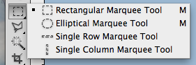
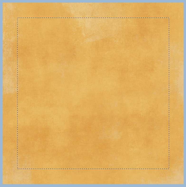
Step 2:  Using the Rectangular Marquee tool, select the area that you would like to have show a different background paper. This should leave a border on your paper with marching ants.  Here is the tool and my chosen selection.


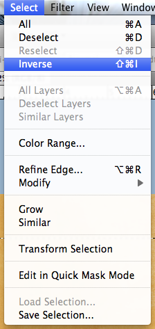
Step 3:  Click on Select > Inverse from the Menu Bar.  This will inverse the marching ants to the edge instead of the inner part of the background paper.  
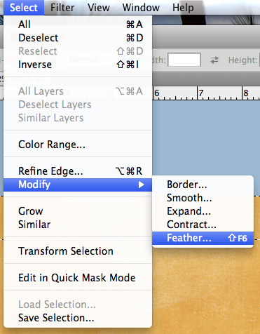
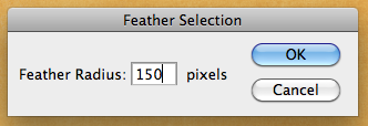
Step 4:  Next choose Select > Modify > Feather.  We are going to soften the edges on the selection.  A menu will pop up, and you can choose any value you like, but I found that it works nicely when between 100 and 250.  For my example, I chose 150.


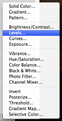
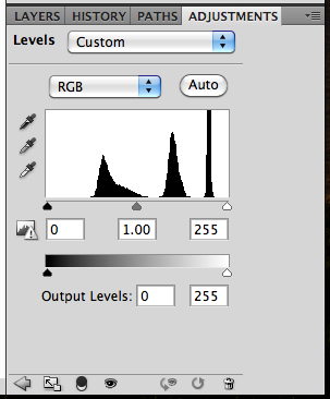
Step 5:  Next, you will clicl on the half black/white circle on the bottom of the Layers Palette. Choose Levels (or from the Menu Bar you can choose Image > Adjustments > Levels.)  When the adjustments menu appears, you will slide the middle GREY triangle toward the right.  You will see the paper change all on the selection.  


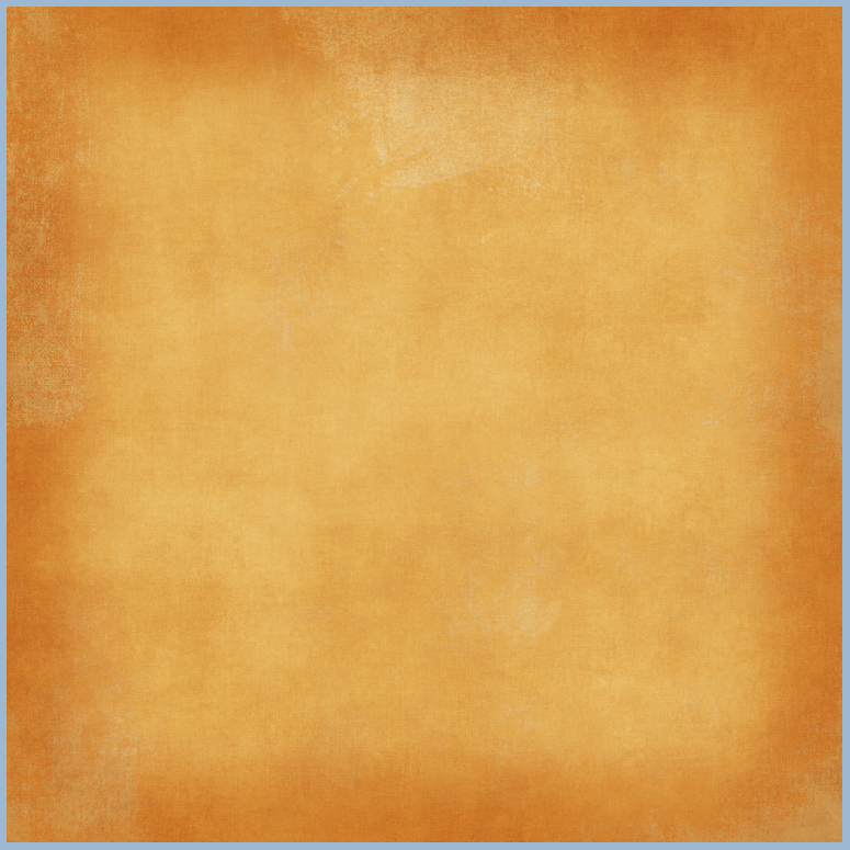
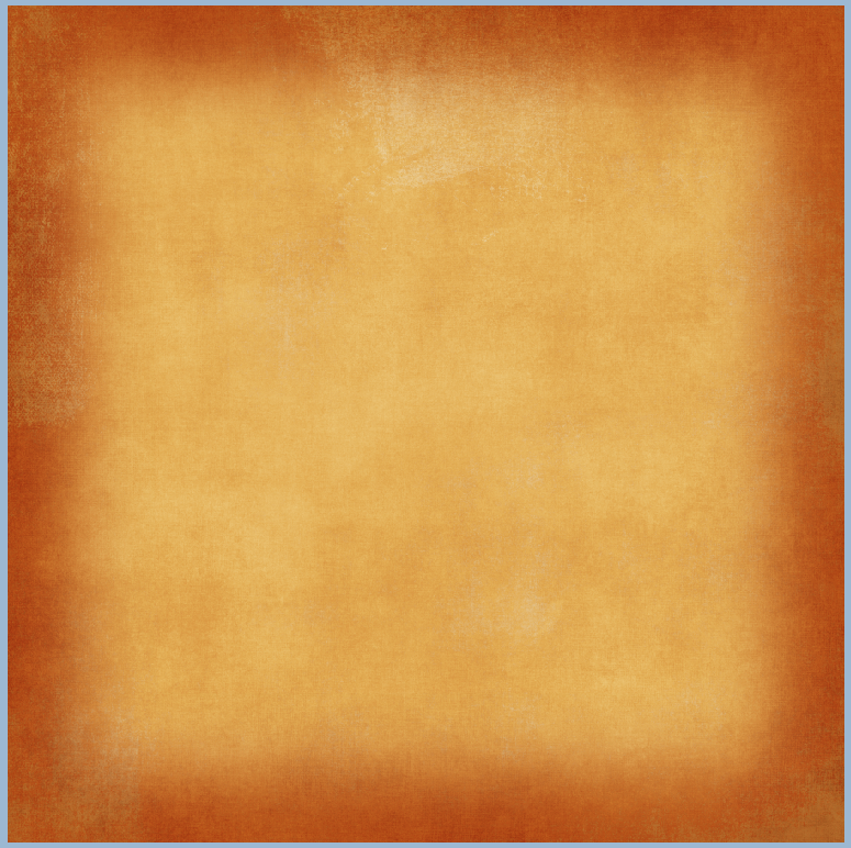
Here is what my plain background paper looks like after playing with the adjustment level.
Here is another version with the slider closer to the right (towards the white triangle). 
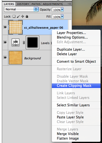
Step 7:  Now, to incorporate more background papers, you can layer them and clip them to the adjustment layer. After you have opened another background paper, make sure the layer is above the adjustment layer.  Next, right click and choose Create Clipping Mask.  
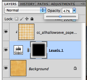
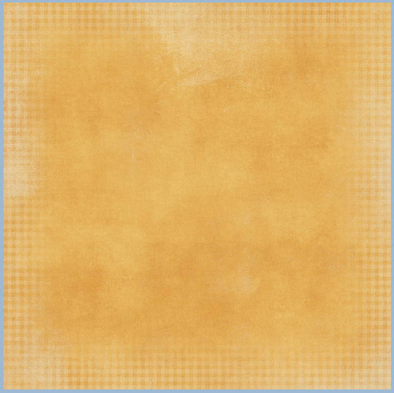
Step 8: Clip the paper, and then you can play with the opacity of the top background paper.  Here I've lowered mine to about 47%. And the final background. 


Looks cool, right!  I can't wait to incorporate this in my next layout! Here are my layouts!


Originally created by me for Chelle's Creations: HERE!

Thanks for visiting and I hope you'll come back!
Jenn/jk703


Wednesday, November 16, 2011

Tutorial: Cross Processing

Cross Processing.... aka Light Leak Effect!

One of the great photography techniques is cross processing. It gives pictures a fun retro feeling that can be gorgeous, different, and striking all at the same time. Before digital photography (in the dark room) film was processed using chemicals. Different types of film needed different sets of chemicals. Slide film needed one set, a different set was needed for black and white, another for color . . . and so on. If you used certain chemicals with a different film, many times the photographs had both a high contrast and a color cast to them. Cross Processing itself is the procedure of deliberately processing film in a chemical solution intended for a different type of film. Although working hands-on with film is not something many digital scrappers do, we can achieve the effect using Photoshop.

The color cast actually looks quite artistic. There are many photographers that have made use of this processing to deliberately create an artistic look to their photographs. The look has become more popular recently because it's found its way into magazine advertising and for artistic wedding photography.

Here is one way to achieve that cross processed look:

Step 1:  Open and re-save your photo with a new name.  You can always pull the original if you need it. Here is my photo cropped:


Step 2:  Duplicate your image using Control/Command J.  Then on your duplicated image, run the Image > Auto Contrast.


Step 3: Add a levels adjustment layer by clicking on that button on the bottom of the Layers Palette.  It looks like a half white/half black filled circle.  Once the levels adjustment layer opens, you will be changing the color and sliders.  From the drop down menu, choose Red.  There are top sliders and bottom sliders. Now, slide the white triangle on the top slider to approx. 200.  The bottom black triangle on the bottom slider should be moved to 200 also.  Red is done.


 What your photo should look like at this point:


Step 4:  Now we will choose blue from the drop down menu. On the top slider, move the black triangle to approx. 100.  On the bottom slider, move the white triangle to approx. 150. Now, we have a bright yellow/red photo, that is a bit funny looking!

Here is what your photo should look like after this step:


Step 5:  Choose the Gradient Tool.  Most cross processed photos look as if the light leaked in on one side or in areas of the photo.  You can also access this tool by pressing "G."

Step 6: Click on the rectangular gradient on the Tool Options bar.  A menu will open.  Choose the first one, called Linear Gradient, which is a gradient from the foreground to background color. Press "D" to reset the color palette to the default black and white.

Step 7: Click, drag and release. You will click on one spot on the photo, hold down the mouse button and drag in another direction, and then release the mouse button.  Make sure that the Levels Layer in the Layers Palette is active when doing this.  Your first click will receive a full level of the adjustment layer, while the dragged areas will receive a gradient of the adjustment.

Play around with this step.  Try click, drag and release in a diagonal line, or with a longer drag, and don't forget a really short drag.  The look of your picture will turn out differently every time.

Short Drag:


Opposite Drag:

Diagonal Drag

Step 8:  When you find the gradient treatment that you like, you can adjust its intensity with the opacity button.  On my example, I lowered it to about 67%.  Find what appeals to you.

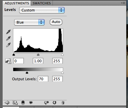
Step 9:  Last step... adding a bluish tint to the shadows. This is an option and may give it a more retro, film feel.  Add a new adjustment layer, and position it below the original Levels Layer.  Choose Blue from the Drop Down Menu and move the black triangle on the bottom slider to about 70 or so.

Here is my final image.

Here is another version where I added a vignette.


I'd love to see some of your photos and how they turned out!
Hope you enjoyed this technique... and thanks for visiting!


Jenn (jk703/The Typative Scrapper)