Showing posts with label Chelles Creations. Show all posts

Tuesday, May 8, 2012

I DID IT! Printed My 1st Album! & RadLab

Hi Everyone.... Lots to share... SO... I actually bit the bullet, and had my 2011 Rewind Album printed!  Yes... printed!  I was waiting as patiently as I could wait, and it arrived on Monday afternoon!  I was sitting at work, itching to leave and rip open the box! I LOVE it!

It is so awesome to see it IRL rather than my computer. No matter how much anyone tells you that it is great - you need to print to realize what they mean!  The pic on your screen is nothing like the real thing! Actually seeing it and holding it is weird and so cool! Seriously!

OK... I am not the best scrapper ever, not the best speller, or the best at thinking things through. BUT, I love my album, and what mistakes I notice are mine and mine alone. Most are really silly and make me laugh at myself - like the HUGE staple, or a Misspelled Title (Litte instead of Little, lol!) and the numerous spelling/typing errors in my journaling. For me, it's sort of like "It is what it is..." I wasn't able to fit all my pages so far into this album, so I made a first chronological album, and may print pages for a second album... yes, I scrapped a lot! :)

It was 98 pages long, and I got a nice brown leather album, and had a peek spot for an image. Each page has a nice thickness, and my kids loved looking at them already!  My oldest wanted to take pieces off the pages, and loved that they looked real to him!  Made my night when he said that!  He already asked if he could take it to school!  LOL!  Um... not yet, I have to show it off first!

My images are not the greatest!  I haven't replaced my camera, so I had to use my distance lens, and I put my book on the floor!  I was standing on my couch up high, trying to get the pictures!  I couldn't take a picture for every page, but I got a bunch! Here are some pages... All of the images are linked to my layouts in the gallery if you need credits.
Spinky Dink Scraps Kit

Spinky Dink Scraps Kit


Chelle's Creations Kit, Happy Scrap Girl Watercolor 
Textures and Scrapping with Liz Template


Chelle's Creations Kit, Happy Scrap Girl Watercolor 
Textures and Scrapping with Liz Template


mle: Scraps by the Brush Kit and 
Scrapping with Liz Templates

Jennifer Labre Designs Kit

 Crossbones Cuts Kit and 
Scrapping with Liz Templates

LCC by Amy Stoffel Kit and 
Scrapping with Liz Templates

Tracie Srtoud Designs and Captivated Visions 
Kit with Scrapping with Liz Templates


Designs by Kat Kit and 
Fiddle Dee Dee Templates


LCC by Amy Stoffel kit and 
Fiddle Dee Dee Templates 

Tracie Stroud Designs Kit and 
Fiddle Dee Dee Templates

Tracie Stroud Designs and 
Fiddle Dee Dee Templates

Stolen Moments and Flergs Kit with 
Templates by Fizzy Pop Designs

Chelle's Creations Kit with 
Scrapping with Liz Templates

Chelle's Creations Kit with Scrapping with Liz Templates, 
and my handwriting font - Typative Tall by wm[squared]


Awesome!  I love it!  I'm so glad this venture into digital scrapbooking has really made me proud of my creativity!  My husband loves it too!  He sat for a long time and read each page, and really loved looking at the book!  Made my night!

On top of that wonderful album... I can share that I am a RADvocate!  WOOT!  This means if anyone tried and eventually buys a purchase from Totally Rad, I can ear a comission!  No pressure there... especially if you give it the 30 day trial of the RadLab... you will not want to use anything else for photo editing!  Check it out here!


Well, there you have it!  My Album, and Totally Rad!  YAY!  Thanks for visiting and I hope you come back soon!
Jenn
jk703/The Typative Scrapper


Sunday, November 27, 2011

Tutorial: Mixed Edges


Hi Everyone!  I hope you all had a great Thanksgiving!  I'm tired, and did lots of laundy today from our weekend away visiting family!  Today, I thought I would share a fun and new to me technique that I just recently learned.  We all love our digital scrapbooking papers, and Chelle sure has some awesome ones!  Here is a way to mix up the papers and get a cool effect for your backgrounds.  

For today's tutorial, I've used papers from Chelle's All Hallow's Eve kit.


Step 1:  Open up a new document and then one of the background papers. 
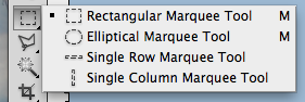
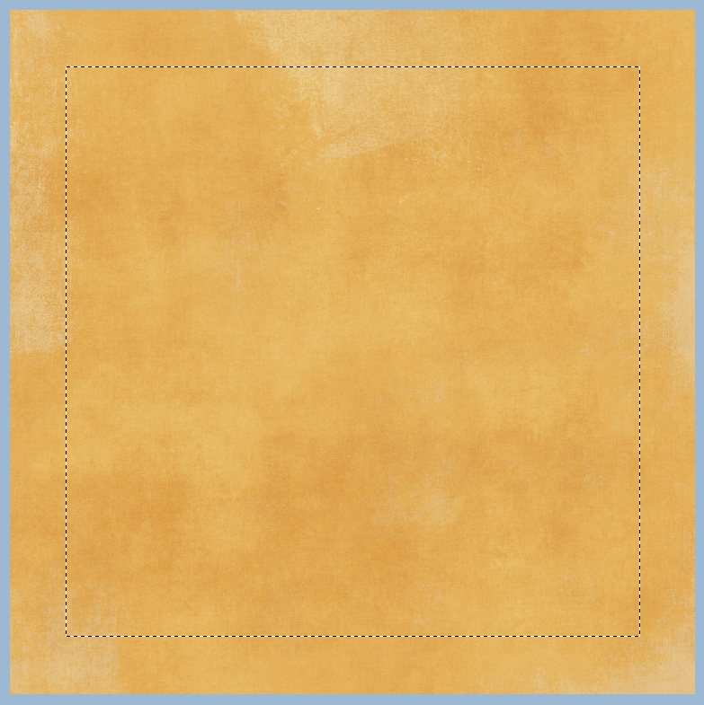
Step 2:  Using the Rectangular Marquee tool, select the area that you would like to have show a different background paper. This should leave a border on your paper with marching ants.  Here is the tool and my chosen selection.


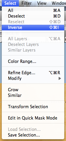
Step 3:  Click on Select > Inverse from the Menu Bar.  This will inverse the marching ants to the edge instead of the inner part of the background paper.  
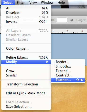
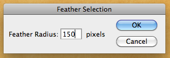
Step 4:  Next choose Select > Modify > Feather.  We are going to soften the edges on the selection.  A menu will pop up, and you can choose any value you like, but I found that it works nicely when between 100 and 250.  For my example, I chose 150.


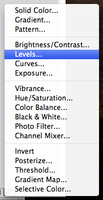
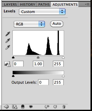
Step 5:  Next, you will clicl on the half black/white circle on the bottom of the Layers Palette. Choose Levels (or from the Menu Bar you can choose Image > Adjustments > Levels.)  When the adjustments menu appears, you will slide the middle GREY triangle toward the right.  You will see the paper change all on the selection.  


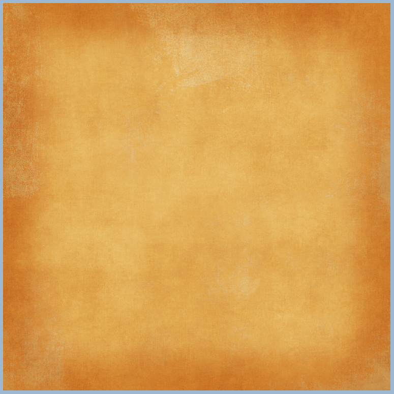
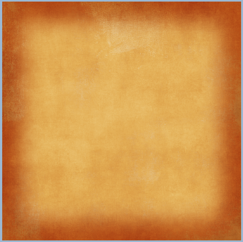
Here is what my plain background paper looks like after playing with the adjustment level.
Here is another version with the slider closer to the right (towards the white triangle). 
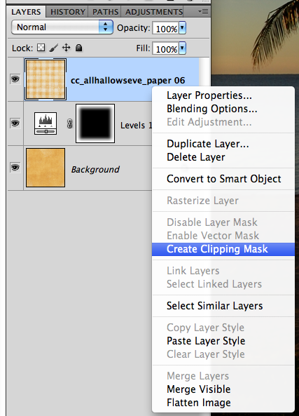
Step 7:  Now, to incorporate more background papers, you can layer them and clip them to the adjustment layer. After you have opened another background paper, make sure the layer is above the adjustment layer.  Next, right click and choose Create Clipping Mask.  
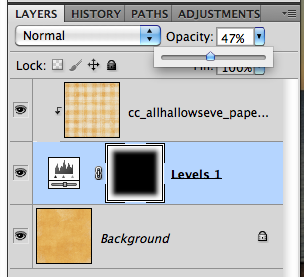
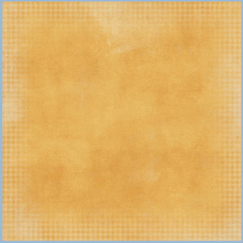
Step 8: Clip the paper, and then you can play with the opacity of the top background paper.  Here I've lowered mine to about 47%. And the final background. 


Looks cool, right!  I can't wait to incorporate this in my next layout! Here are my layouts!


Originally created by me for Chelle's Creations: HERE!

Thanks for visiting and I hope you'll come back!
Jenn/jk703


Wednesday, September 28, 2011

Black and White Made Easy


Hey Everyone!  It's Hump Day!  Yay!  I hope that you are ready for the upcoming weekend! It will be October!!!   Today, I decided to make my post about a quick How-To for Black and White Photos.  The weekend will be a perfect time to try out this technique. It's not too difficult and can really make your otherwise dull black and white photos pop!

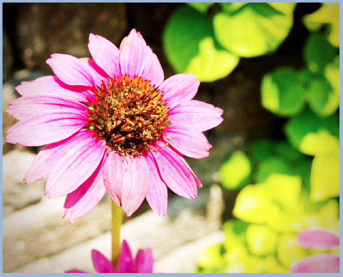
Black and White, otherwise B&W, can be a way to create a striking photo and bring a lot of contrast to your digital scrapbooking layouts.  Here is my starting photo - a pretty flower I snapped while on vacation this summer. It is a very bright photo and I love the
perspective.


Let's say that I am making a layout also with bright colors in the papers and elements, but I really want to use this photo.  Instead of a too busy or too colorful page, I want to create a focal point on my layout.  To make the photo pop, I am going to make the photo B&W.
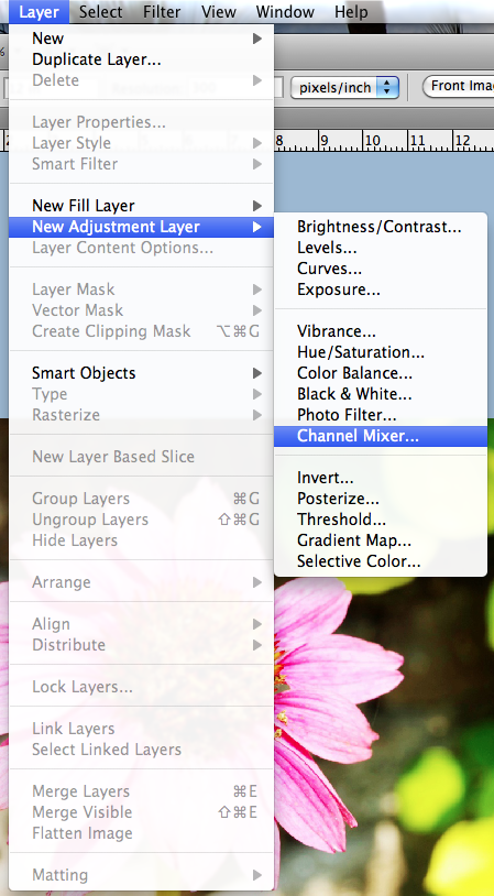
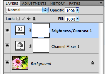
First, remember to save your image before completing your edits so you will always have the original photo if you ever needed it. Next, with the photo selected,  in the Menu Bar, click on Layer. Scroll down to New Layer Adjustment, and choose Channel Mixer.
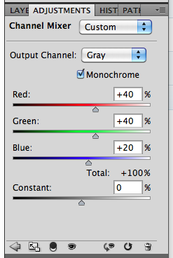
The Adjustment Palette will pop up (mine is within my Layers Palette, just another tab).  You will see a few slidebars, and a small box that is for  Monochrome.  Click this box and make sure there is a check mark ticked.
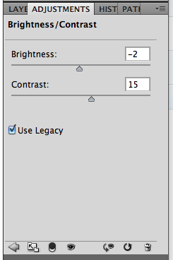
Your photo will turn to an instant Black and White.  But wait... there's more... Again, in the Menu Bar, click on Layer > New Adjustment Layer > Brighness/Contrast.  Here are the options available to you in this particular adjustment.
When you look at the Layers Palette, you will now see another new adjustment layer. By tweaking the contrast, your photo can become a little more sharper and really jump off the page.  Here is my after picture below.  See how the center of the flower is a little more focused and the edges of the shadows are just a tad deeper.
Here is my final Black and White Photo.
There you have it - an easy way to make a photo black and white!  Plus, the know-how to tweak the brightness and contrast to your own liking!  Enjoy your pictures and make
them pop off the page!

Originally created by me for Chelle's Creations: HERE! 

Have a great day, and thank you for stopping by.  Come back soon!
Jenn (j703/The Typative Scrapper)


Thursday, September 8, 2011

Filter Focus: High Pass Filter

Hi Everyone... I'm here to show a sneaky easy peasy tutorial to sharpen with a slight pop for your photos! Plus, we are going to learn another filter that is available in Photoshop and Photoshop Elements. We are going to look at the High Pass Filter today...

The High Pass Filter adds a little pop to your photos within seconds and is really easy. The filter allows you to control the awareness and emphasis of the edges of objects that are in your photos. It is also used to sharpen your photos when they might just be a tad out of focus. Here we go...

Here is a Colin... my model for this tutorial! lol! My image is unedited and hasn't been processed at all.
1. First, save your image so the original will be available in case there are any problems. Duplicate your photo onto a new layer. (PC Ctrl-J and Mac Cmd-J).

2. Working on the new layer, choose Filter > Other > High Pass.
3. Set the radius of the pixels somewhere between 3 and 12. Click on Apply. I know that is a large range, but play with it, you can always undo! For my example, I used a radius of 4.7.
4. Now, in the Layers Palette, you are going to change the blend mode of the duplicate image, the one that is grayed out. Choose Overlay.
5. Play with the opacity of the overlay, and you will see slight differences in the edges in your photo. This brings out some of the color and allows for an easy simple pop.


Tips:
  • To sharpen the photo without a color pop, try the Soft light or Hard Light blend modes.
  • Adjust the sharpness based on what you will be doing with the photo - print or web versions.
  • Try creating different layers, and changing the blend modes, and opacity to see what you like the best.
  • Try it out on your layouts before uploading to the galleries! A little sharpness goes a long way!
Another example is my sandwich, yes... my life-like magnet sandwich! Looks realistic, right?!
Before High Pass:
After High Pass:
See the top of the sandwich and edges -- they are a little more defined with just a tad of a pop added to the color.

There you have it - an easy pop and sharpen! Hope you enjoyed this tutorial! I'd love to know what you want to see here on Chelle's blog - so be sure to tell us in the comments! Enjoy the rest of your week!

I created the original post for Chelle's Creations.

Thanks for visiting!
Jenn (jk703/The Typative Scrapper)