Showing posts with label Chelle's Creations. Show all posts

Thursday, May 3, 2012

Hello... Hello... anyone there? Catch Up & Tutorial

Hey everyone!  Yes.... I intended to start the year blogging away, but things got away from me... and I seemed to take a long break.  Well, I've decided that I need to get commited and back to at least a weekly post!  Even if it is just layouts to share.

So.... I have about 15 tutorials that you have to check out and I must continue to share... whether of not anyone reads these, I know I have used my own blog as a reference!  Just last night, I was looking at the Cross Processing Tutorial, and I was laughing at myself!

Plus, today - I signed up to be approved for a RADvocate. I know... what?! is going right through your mind!  OK... I'll explain!  Totally Rad is an awesome photshop plug in that transforms your photos in as few clicks as possible - and it is that easy!  Check out this video from their website: Watch RadLab in Action!  Hopefully, I am accepted as a RADvocate. That means that anyone who purchases something at Totally Rad, from clicking on a banner or from my posts, earns me a commission.  Actually, I'm not too worried about a commission - but sharing this awesome feature is really cool!  I already know of two friends that got it when I told them about RadLab!  Plus, you can try it before you buy - so people know what they are getting beforehand!  Awesome in Photoshop Plugin form! Check it out and keep your fingers crossed for me! :)

Anyway... there is lots going on in life.... My boys are getting bigger, my life crazier, and my work even more boring-er!  LOL!  Making lemonade here!  :)  I'll share the good stuff - kids, and scrapping!  I've completed my first digital scrapbooking album!  Yes... my first and I've been doing this for two years. the first was learning, and the second had a goal - and I completed it!  Yay!  Check it out! I'd love to know what you think!  :)

See it larger, click HERE!

It is iNSD, WOW... there is lots going on!  Check out Scrap Orchard, ScrapMatters, Scrapbook Graphics to get awesome goodies. Those are the stores my designers sell at, lol! There are some awesome deals going on this weekend!

Here are some favorite recent layouts.... 

First one I wasn't even sure of - it's a double, 12 x 24, and that large photo is not the norm for me, but I love it and got a Gallery StandOut at ScrapMatters!  That sure makes you feel better about a layout you aren't sure about, lol!  Colin at the beach with the NYC skyline in the background - April 2012. 
Mix and Match by Scrapping with Liz
Fiddlesticks by Amy Stoffel
Font is SNF Journaling Bold.

Here is one more... I just love the outcome of this layout and no template - which is unheard of from me!  LOL! Here is Colin (again) smiling from the pool last summer. 
I need to look for favorites with Shayne in them for my next post! :)
Font is LD Thankful (Catch) and The Chuck Wearer by Heather Hess. 


Now... I'll end with a tutorial.... one of my favorites!  Adding Texture to Paint...

I find that I really like my pages to look as paper-like as possible. I love great textured papers, felties, scatters and paint. Paint stumped me for awhile, especially how to make it look like it was painted on my paper. Today, I'm going to show you a technique to get paper "painted" on your layout.

I'm using Chelle's Creation's Home for the Holiday BundleScrapping with Liz's 3's a Charm template pack and Watercolor Overlays 3 by Happy Scrap Girl. I'm in the middle of working on my layout, and added a paint swatch to my layout. I want to give it some texture, but I really didn't like the textures that Photoshop has, so I dug into my digital scrap supplies, and pulled out a watercolor overlay.


Step 1:
Open the overlay that you would like to use as your texture in a new photoshop file. Then File > Save As a .psd file. I leave the name of the file as is, so that I can give credit to the designer when uploading my layouts. Remember where you saved your new overlay.


Step 2:
Once you have that overlay saved as a .psd file, click back into your layout. With the paint layer selected, choose Filter > Texture > Texturizer.


Photo & Video Sharing by SmugMug


Step 3:
A new Texturizing screen will pop up. On the right side of the pop up, you will see a small triangle pointing down with some lines. Click on this, and choose Load Texture.


Photo & Video Sharing by SmugMug


Photo & Video Sharing by SmugMug

Step 4:
A second new pop up menu will appear and you should choose the overlay .psd file that you just created a bit ago. Now, under the small triangle, there are 2 sliders. Play with those, until you like the look of your paint. This is a more personal option, and choose what pleases you. For mine, I left the scaling at 50, changed my Relief to 21. There is one more option called Light, and you can change this depending on how you shadow and your angle on your layouts.

Photo & Video Sharing by SmugMug


Photo & Video Sharing by SmugMug

Step 5:
Here is what my paint looks like after applying a watercolor texture.


Photo & Video Sharing by SmugMug

Photo & Video Sharing by SmugMug


My Final Layout - share YOUR LAYOUT using this technique in the comments - I'll be sure to visit and leave some love! 


I know.... I know... that was a long post!  LOL!  Lots goin on!  Hope you come back soon, and I'll be back maybe to share some iNSD goodies... 

This tutorial was created for Scrap Orchard, originally by me. You can view it: HERE! 

Thanks for visiting!  Hope you decided to come back and take a look see - I'm glad to have you!  

Jenn/jk703
The Typative Scrapper

Friday, September 30, 2011

Vibrance Tutorial

Hi Everyone!  Hope you are all having a great start to your weekend!  So, for my tip today, I'm going to share a little secret to adding a little vibrance to your photos QUICKLY.  We are always trying to do things faster, and that works with our scrapping too!  Here we go...
Here is my original picture opened in Photoshop. (I use CS 5)

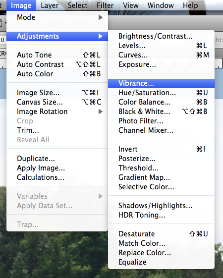
Now, in the Menu Bar, I choose Image > Adjustments > Vibrance.

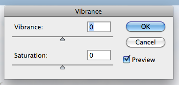
Next, a small pop up menu will appear.  It will have sliders marked Vibrance and Saturation.  Slowly move the sliders to the left and right. If you have the Preview box is checked off, you will be able to see the changes in your image as you are sliding the cursor.

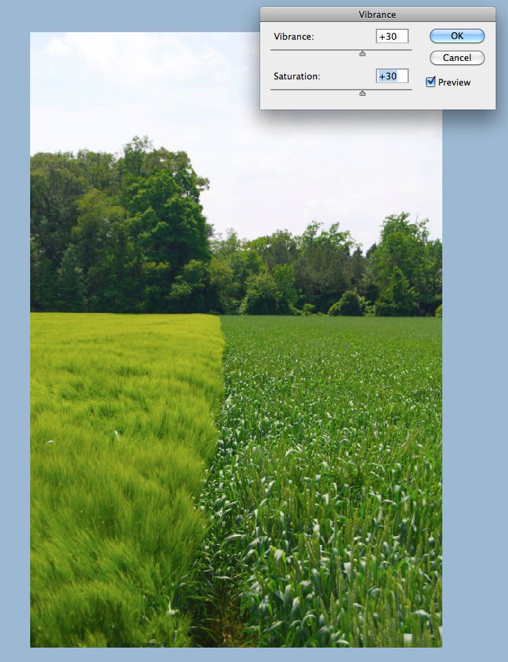
I moved my sliders to the right, and increased the vibrance and saturation.  Play with them at different settings, and see what you like!  A quick and easy way to add a little pop to your photo.

Thanks for stopping by and checking out a quick tip!  Hope it added a little vibrance to your day!


Originally created by me for Chelle's Creations: HERE!


THanks for stopping by!  Come visit soon!
Jenn (jk703)

Thursday, August 11, 2011

Filters: Watercolor Effects

Hi everyone! I've had a rough week already, so it is nice to be able to check out the forums, and pop into the blog here and share a fun technique!

We are going to delve into the Filters that you have in Photoshop! I know, you are probably repeating what I said when I first heard of Filters. "Fil... what - is that another tool in Photoshop?" The first one that I am going to show you is the Watercolor Effect. This is a part of the Artistic submenu in your Filters Menu.

First, here is Colin... don't mind the pic... it was taken after a bad haircut, lol!

OK... First things first. Open your image, and edit as you need. Save the file with a new name. This way you have the original to fall back on if there are any problems.

Next, in your layers Palette, duplicate your background image (your picture), and then turn off that layers visibility. Using the Eraser Tool, you will slowly erase the edges of your image, and with each pass, get a little closer to the main subject. Removing the image can allow for focus, as well as a cool option in the end!

Here is my Eraser's settings when I erased my picture edges.
Here is Colin, less the pesky edges. :) Below Colin, you can see my Layers palette and what yours might look like up to this point.


Up next is the fun filtering! In the top menu toolbar, you need to choose Filter > Artistic > Watercolor.
After you click on Watercolor, a big screen will pop up, and then your photo will appear -- a rather large version! I made mine smaller and started to play with the filter. First, here are just some of the filtering effects you can play with, and under each subheading are more! You have to try them all out!

On the right of the menu you can see the list of the filters that you can play with on your image. Next to that, on the right, there is a small area with different levels and options you can change. This potion will change for each filter.

So, for my example, I click on Watercolor and this is what I came up with:
It is a little hard to see, so I've added a closer view:
A nice little effect to change up your photos. That is it... nice, and simple! Remember above, I said to turn off the visibility of your original picture.... well, here is what happens when you turn it back on. I've added the picture of Colin close up again, so you might be able to really see the detail.

Take a closer look at the meeting point between the areas that I had erased and the areas that are watercolored. There is a slight blend of the original and the Watercolor Filter. Looks pretty cool! I know it is a close up, but on something a little more focused, I think this will look really cool.

Some final tips with the Watercolor Filter:
  • For the best results - erase most or or all of the background before applying the filter.
  • Lighter colored photos give a delicate feel, while darker colored photos will provide a moody after effect.
  • If you lose a lot of details, duplicate your original photo and layering the duplicate on top of the Watercolored Filter layer. After moving it above, choose the Multiply Blending mode, adjust the opacity, and this will allow you to bring those details back.
Well... that is a fun technique... I hope you liked it! If there is something that you would like to see, just leave a comment. :)

Happy Day to you all!
Jenn (aka jk703/The Typative Scrapper)

Monday, June 6, 2011

Extractions! Sweet and Simple Basics!

HI Everyone! I'm back to share a tutorial for you! Today I will touch on Extractions, using the Magnetic Lasso Tool.

Extractions are a time consuming task, and it takes a lot of practice! I, by no means am an expert at this, but I have the basics down! There are basic things that you can learn how to extract, and after you learn them, you could extract anything! There are multiple ways to extract images: Extraction Filters and Presets, Magic Wand, Polygonal Lasso Tool, Pen Tool and the Erase Tool. My example will show how to extract using the Magnetic Lasso Tool. It is easy to extract an object but very difficult to extract hair from a windy day picture. I'm going to start with the basic extraction of a person. Meet my son, Shayne. :)


Photo & Video Sharing by SmugMug

OK… first things first. Open your photo, Crop, and complete any photo treatments and photo corrections. Save this as a new file, so the original will be available later, if needed.

Double click on your photo layer in the Layers Palette and the little Lock will disappear on your background, changing the picture to a layer.

Next, Choose the Lasso Tool from the toolbar, and choose the sub menu tool: Magnetic Lasso Tool. This tool allows you to slowly go over the edges of the image you want to extract, adding anchor points throughout the edges. My example uses a feather of 3 pixels, and a width of 7 pixels between automatic anchor points.


Photo & Video Sharing by SmugMug

With your photo selected in the Layers Palette, slowly move the Magnetic Lasso tool around the edge. You will see anchor points popping up as you move along. If you accidentally went the wrong direction, you can slowly move backward to remove the last anchor point, or you can press delete. Unfortunately, I'm unable to get a screen shot of the anchor points - they disappear when I try!

Once you have connected your anchor points, you will have the marching ants around your image, the portion that you want to extract.


Next, you can refine the edges by clicking on the Refine Edge in the Magnetic Lasso menu bar. The items I use the most are the Feather and Shift Edge. The feather gives the edges a softer look, and the Shift Edge helps remove unwanted background colors from the selections edges.


Before Feather and Shift Edge:

After Feather and Shift Edge:

After you've refined the edges, you will choose Select > Edit in Quick Mask Mode. You image will have the background in bright red, and the image will remain in color. The red will be the section that is to be removed. At this point, you will either add or subtract to your selection by using the Selection Buttons.


Selection Buttons:


Choose Select > Inverse. Your marching ants will have moved from around your selection to marching around the background. Press Delete. You image is extracted, and the background has been replaced with the invisible background. Right click on the image in the layers bar, and duplicate it to your layout or project.


Hope you get to trying this tutorial out soon! See… extractions aren't soooooo hard, right?! I hope this tutorial is clear, and if you have any questions, please let me know by leaving a comment or PM-ing me over at ScrapMatters. Enjoy your week!

This post was originally created by me for Chelle's Creations: HERE!

Jenn (jk703/The Typative Scrapper)

Tuesday, April 26, 2011

Sharp Uploads: How to!

Hi everyone!!!! I have a little tidbit for you today! When I first started scrapping digitally, I was so green and so baffled most of the time! Things get easier as you learn more about your program, play with features and try new things out.

So, when I first started, I was so confused about saving for the galleries that I literally no clue what I was doing! Today's tutorial is to help you Save for a Gallery Upload! Hope you enjoy it!

For my example, I've used Chelle's Blessings Kit. It is a beautiful kit and perfect for many milestone pages, such as births, weddings, communions, and other events you would like to scrap! My layouts end up being 600x600 at 72 dpi. I usually scrap double pages, and will convert each side to it's own file for the web as well as a file for my album uploading.

This is my layout:


First, you should have your layout open in Photoshop.
Flatten the image by right clicking on the topmost layer in your layers palette and choosing "Flatten Image."


Photo & Video Sharing by SmugMug

Duplicate the layer. You should have a Background layer and a Background Copy layer. You can re-name this Sharpen if you like or something you prefer.

Next, you will run the High Pass Filter on the duplicated layer (Background Copy or Sharpen if you renamed). Click on the Filter in the Menu bar > Other > High Pass.

Photo & Video Sharing by SmugMug

My pages usually use a figure between 1.4 and 6. More than that makes my layout look off. Click ok. You should now see a grey box on the layer above your layout. Do not flatten at this point.

Photo & Video Sharing by SmugMug

Photo & Video Sharing by SmugMug

Next is the addition of a Color Pop, though this is optional. To add a Color Pop, add an adjustment layer to the original layout layer, Background.

Photo & Video Sharing by SmugMug

Your adjustment layer is an adjustment in Hue/Saturation, and you will be changing the saturation specifically. My mouse moved, so my screen print changed when I took the "picture," so your Hue/Saturation should be highlighted on your screen. Click on Hue/Saturation. You will be brought to this screen.

Photo & Video Sharing by SmugMug

The range can be anywhere from +1 to +10, depending on the colors and brightness of your photos or kit choice. Once the Color Pop is added, you can change the opacity to lower how much of a POP you want. You will have to change the Blend Mode to Overlay.  Just make sure you have the Hue/Saturation adjustment layer selected in the layers palette, so you are adjusting the correct layer's opacity and blend mode.

Flatten the image. Depending on your needs, you can save this version as a jpg since it is still full size. It will be ready for uploading to an album. If you are going to upload to a gallery, here is what I do.

First, choose Image on the Menu Bar, and choose Image Size. Change the 3600 x 3600 sizes (or 12 x 12) that are there to 600 x 600 (or 2 x 2). Click ok.

Photo & Video Sharing by SmugMug

Photo & Video Sharing by SmugMug


Next, choose Save for Web and Devices from the File Menu drop down. You will be brought to a different screen from your original layout.

Photo & Video Sharing by SmugMug

In the top right of the Save for Web Screen, you should see an options panel or menu drop down, click on this. Click and choose, Optimize to File Size and a menu will pop up.

Photo & Video Sharing by SmugMug

Photo & Video Sharing by SmugMug

Enter in the number you wish -- I always enter 149.5, just to be sure I am below the 150kb limit. Click ok, and your image re-sets to the correct highest quality for the size.

Photo & Video Sharing by SmugMug

Click save, and save your WEB version. That's it.... nice right sized, sharpened, gallery layouts - ready to go! There are multiple ways to sharpen and re-size, I just thought I'd share this one, as it is just my own method. That is a great time-saver to use that optimize feature, right?!

Once you get used to these steps, try to save them as an action! Then all you have to do is click the button and presto! :)

Created originally by me for Chelle's Creations: HERE!

Thanks for visiting today! Have a great week!
Jenn (jk703 or The Typative Scrapper)