Wednesday, December 22, 2010

December Goodies! Come take a Peek!

Hi!  Happy Holidays to you and your families!  I'm just popping in to share some of my recent December layouts!  I really, really have to get these all put in a book over the school break, so maybe once I have a book being printed, I can share that link!  


First up is my 2010 Christmas Card!  I just loved it... it took awhile, but I was so happy with it!  My little boys, and me making them giggle so I could get a somewhat decent pic!  It only took me banging a container of M&M's on my head!  Who would have thought!?  I think that someone should have taken a picture of that!


2010 Christmas Card
Supplies Used:  Erica Zane -- A Touch Of Winter(some snowflakes), GG Digital Designs -- Winter WishesFiddle Dee Dee Designs -- Fuss Free: Christmas Greetings and Ali Edwards -- Holiday Word Art.


Goose!  
Photobucket


Supplies Used:  Sugar On Top Collab by Spinky Dink Scraps and Project BBlueprints Set 6 by Studio True Blue, Fine Line Page Titles No. 3 by Katie Pertiet, and the font is CK Smile.


Out on the Town
Night Out Double


Supplies Used:  Winterberry by Jennifer Labre Designs, and the font is Times New Roman.

Thanks for looking and checking out my layouts!  Would love to know what you think?  Trying to improve myself, so Constructive Criticism is welcome!

Have a great day!
Jenn (jk703)

Friday, December 17, 2010

Rule of Thirds...

Huh? You say.... lol... Well, I am talking about photos and how you take them!  Just thought I'd share a tip for photography!  Now, I am trying to learn as I go, so I need to practice my own tips as well!  But, through my research, here is what I've found to be useful!

First, let me explain quickly what the Rule of Thirds is.  It is the basic dividing of a photo into thirds...by rows or columns.  Though, in my opinion, it is more of ninths, because there are nine quadrants!!  LOL!  A lot of times when cropping, you will see the grid, like in my picture below:


Those grid lines can change your picture so much!  Right now, I've used the crop tool to crop the photo and place the sun in the center of the picture!  Kinds of looks funny! The Rule of Thirds is a basic assumption that you should place the primary parts or focus on the grid intersections.  I've cropped my photo, and added some red dots to show you how I aligned my photo!  


I actually like the way it cropped.  The boat is off to the side and my sunset with reflections looks nice to the left a bit!  It provide a well balanced, but interesting photo!  Many cameras have a grid function that you can add for your viewfinder (Dslr) or on the Point and Shoot models.  Check your reference manuals!  Here are some more examples from a trip we took to the Florida Keys! On some, you will have to imagine the quadrants, lol!  


Now, remember - this is just a guideline... many times rules are meant to be broken!  Here is an example.  I loved how this picture turned out of my Dad and cousin... with the scenery.  If I moved the photo based on quadrants, it didn't look right!  


Share some of your photos... post a link!  Have fun with your photos and be sure to come back for a visit soon!

I created this original post for Jennifer Fox Designs: HERE!

Happy Holidays!
Jenn 

Monday, December 13, 2010

Tutorial: Adding Catchlights!

Hi everyone! I have a great tutorial here to add a little oomph to your pictures before adding them to your layouts! Catchlights are the reflection in the eye of a light source. Catchlights can be from the sky, flash of a camera, even a TV screen; they add depth and dimension to the eyes in any photo. A little bit of glimmer can add so much more and even add a little sensitivity, beauty, life, inner emotion, ormostly in my personal case, mischief! Here is how to add catchlights to a photo:

Step #1: Open your photo. Zoom into a comfortable level to complete the re-touching. Some people like 200%, while I like to be even closer at about 300%.

Step #2: Create a New Layer above your photo by doing the following. Choose Layer; New Layer.

Step #3: Select a small, soft-edged Paintbrush. For my examples I used brushes that were sized between 5 and 18, and with 0% hardness.

Step #4: Set the foreground color to White or if that is too stark for you, try a shade of grey.

Step #5: Lower the Opacity of the brush to 10-20%. I start lower and then I can adjust as I go along.

Step #6: Brush just above and to the left or right of the iris to mimic a catchlight. If there is a small light in the eye in the 10 o'clock or 2 o'clock area of the eye, broaden and lighten that specific spot.

Step #7: This is optional. Create another New Layer. Paint another highlight opposite the main catchlight at reduced Opacity 5% or less, but you can always up the percentage to get your desired look. The second highlight will help reinforce the translucence of the eye. 

Complete the above steps to the other eye.

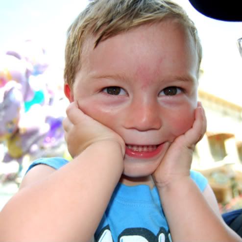
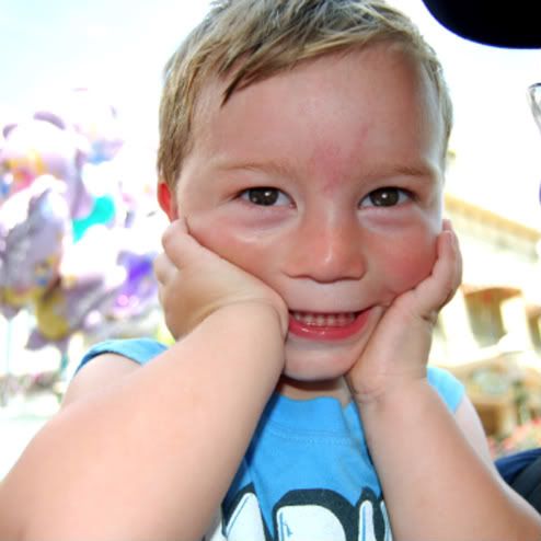
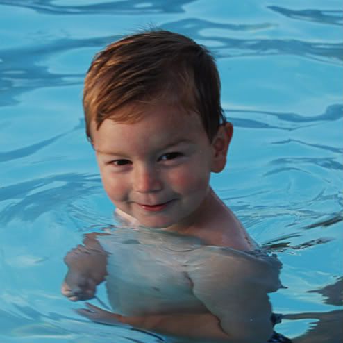
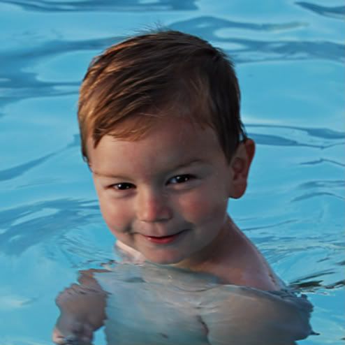
Some Examples -- with my 2 year old, Colin!
Before:


After:


Before:

After:

By working on separate layers, you maintain control of both Opacity and Blending modes, as well as preserve your original image since you can always delete the additional layers if you don't like the result.


Experiment with shapes, softness, and opacity. Be subtle. Remember, catchlights come in all shapes and sizes, depending on the shape and size of the light source, and its distance from the subject. There are no hard rules regarding catchlights! They are without a doubt a matter of personal taste and preference. Have fun experimenting with your photos!
You can get great articles like this one every month!  I wrote this one for the ScrapMatters Newsletter, which you can sign up for: Here!

Have a great day!
Jenn
(jk703)

Friday, December 10, 2010

Trimming - Detailed Version!

ETA:  My images are not showing up... They were uploaded to Blogger, and eaten!!  Sorry about that! (Thank you DoggiNo for letting me know!)  I will be working on getting new images up by the end of the week!

Hi Everyone! I've decided to be a little more detailed and picturesque with my trimming tutorial!  Here is a detailed version for Trimming Your Files! Sorry for the double posting of subjects, but I thought this would help out those who needed pictures and more details!  

We all love our digi supplies, right?!? We've got to make sure we are clearing some room on those hard drives so that you can get some more goodies at Chelle's awesome store! I'm sure you are like me, and there is a ton of kits and ellies in your wish lists!

For my examples I used Chelle's Kit, Tell Me More that comes included with her Journaling Class! It is an AWESOME kit, and the Alpha is fantastic! Sign up today! It starts in January 2011!

When you create a layout, many times you place papers, ellies, and all those fun digital supplies on your layout - parts of those items are laying out in the out of bounds area! When you look at your layout, and click to move something, you might see this oversized bounding box:

Little Helper Page 1 and Page 2
Supplies:  Chelle's Creations Tell Me More Kit and Fiddle Dee Dee Designs Don't Box Me In Set #2
This bounding box means that there are items hanging off your page and taking up space! Things that you might not be able to see on your layouts are taking up valuable hard drive space! Here is how we remove and save space:

Choose Select > All.


Once you choose to select All, you will see the marching ants around your layout. It should appear like this on your screen:

Little Helper Page 1 and Page 2
Supplies:  Chelle's Creations Tell Me More Kit and Fiddle Dee Dee Designs Don't Box Me In Set #2

Next, you will choose Image > Crop. Click on this and your layout will be trimmed of all items that you cannot see hanging off your pages, and don't need to keep.


This does not delete hidden layers. Hidden layers can be deleted directly from your layers palette by right clicking on the layer and choosing delete.


Little Helper Page 1 and Page 2
Supplies:  Chelle's Creations Tell Me More Kit and Fiddle Dee Dee Designs Don't Box Me In Set #2

Why is this important to do to each .psd file you might have? Space! A regular single page layout file can be trimmed and save over 10MB of space! That might not be a lot as a layout, but think of that times 10 layouts! 10MB x 10 single layouts = 1 GB of space! Keep doing that and you will allow your computer to be a little more efficient! Plus, the best part is that you get to fill that space with more digital goodies! Woot!

Hope that helps you free up some space! Let me know if you have any questions - would love to know how much you trimmed today!

This more detailed trimming post was created by me for Chelle's Creations recently.
Found Here!  

Thanks!
Jenn

Tuesday, December 7, 2010

Digital Scrapbooking Tips!

Hi everyone!  I'm here to bring a fantastic blog post for today!  Woot!  I am going to introduce you to a few of my MOST favorite tips for Photoshop and Photoshop Elements!

I started my digital scrapping obsession in March of 2010 -- it sure was fast to get hooked on!  I get all the "support" I need from friends out in Digiland... I really think they just feed into my obsession!  I have at least managed to get one of my close friends into this hobby!  

Linda is now just as obsessed as I am!  As I showed her around our wonderful community, I also shared a few of my tips with her!  She has a graphic arts background, so some were just a re-iteration of what she knew too!  I thought I would share them with you... so here goes!  Enjoy!

Tip #1:  Save, Save and then Save Again!
I have been the victim of layout theft!  Theft from my software freezing, my husband closing photoshop or just me clicking in the wrong spot -- which means that I lost all my hard work!  Then to start over again, and try to get back to where I was is hard to do!  So Save, Save, and Save Again!

Tip #2:  Learn the Scrapbooking Lingo...
Bouncing around in this community and trying to understand all the acronyms, and word of digital scrapping can be daunting! I personally have a stamping and paper scrapbooking history, so I was already lucky to know most of the terms!  Linda and I would chat about our scrapping, and we wouldn't understand each other... we were using different terms!  We would end up in a fit of giggles!  Here are a list of terms that I hear daily:

.PNG Portable Network Graphics
This is the most common high quality file format used to save digital scrapbooking elements requiring transparency.

.PSD
This is the file format for Adobe PhotoShop and PhotoShop Elements. Retains layer and image information that is not transferable between other applications.

.PSP Paint Shop Pro
Default  file format for JASC Paint Shop Pro. Retains layer and image information that is not transferable between other applications.

Scraplift
To create a layout that is inspired from, identical to, or very similar in style and/or content, to a layout created by another person. Scraplifting is generally considered as permissible as long as credit is given to the original creator.

R.A.K  Random Act of Kindness.
To create a layout as an unexpected gift for another person.

Element/Embellishment/Ellies
Refers to any individual decorative digital objects that may be used in a layout. Ribbon, Wire, Buttons, Beads, etc.

Brush/Stamps
In terms of graphic software a brush is a tool that allows you to create a wide variety of effects. It is similar to a stamp or painting tool that allows you to stamp/paint with images. These images can be of varying color, size, transparency and more.

Layer
In image-editing software, a constituent part of an image that can be manipulated independently of other parts.

Mask
A function within select software that allows you to change how your image is seen -- it edits the image to only a part of the image. A mask can have a hard or soft edge, as well as duplicating textures and  allowing you to achieve so many effects.

Tip #3:  Trimming your files!
As you are working on your layouts, you drag and drop papers and elements and place them just so on your pages, right!? Many times you leave things hanging off your pages... the paper only covers half of that 12 x 12 layout your working on... and the other is hanging out, in that unseen out of bounds area.   You can't see it right... so how does it affect you???  It takes up that valuable, MOST VALUABLE, space on your hard drive!  That is space that you could be filling up with more goodies!!!!  What are we waiting for... lets clean up!

When you are done with a page, this is what you do before you press the save button!  Up in the Menubar, there is the tab called Select.  Click on this, and choose All from that drop down menu.  You should see the marching ants roaming around your square 12 x 12 edge.  Next, you will go back to the Menubar, and choose Image, and then click on Crop.  This quick and easy step allows you to trim away all that unseen, space hogging digital imagery.  By completing this step, you can really reduce your file size.  I have gone back and re-saved some of my earlier files, and have seen over a 10MB reduction!  Just think... 10MB x 10 layouts!  that is almost 1 GB... keep adding that up and you have lots of space to fill with more supplies!!! 

This blog post was originally created by me for Geek Chic Scraps: Here!

Hope you enjoyed my ramblings!  Share a tip you can't live without; I'd love to read them!